Lead UX/UI Designer
Led the end-to-end UX and systems design of the recipe-building workflow within our CMS, redesigning a legacy editorial tool into an intuitive, scalable, and automation-driven system. By rethinking core interaction patterns and underlying workflows, I transformed a high-friction process into an efficient experience that reduced task time by 40%.
Overview
Role: Lead UX/UI Designer Focus: Internal tooling redesign, workflow optimization, editorial UX
Meredith Corporation operates one of the largest digital media portfolios in the country, with brands like Allrecipes, Food & Wine, Martha Stewart, and EatingWell reaching tens of millions of readers monthly. Behind every published recipe was an editorial team working inside a CMS — and that CMS was quietly costing them hours every day.
I was brought in to lead the redesign of the recipe-building workflow: a core internal tool used daily by editors across multiple brands. What started as a scoped improvement to one component became a full-system rethink — and ultimately reduced the average time required to build a recipe by 40%.
Problem
The existing recipe-building workflow was built around the constraints of legacy technology, not the needs of the people using it. Editors had adapted to working around the system rather than with it — memorizing formatting rules, rebuilding ingredient lists from scratch whenever an item needed to change, and navigating a rigid structure that offered no flexibility or automation.
The cost was real: time lost to manual workarounds, errors that caused publishing failures, and a daily frustration that compounded across a team building hundreds of recipes a month.
Research
I conducted discovery interviews alongside a UX researcher. We used open-ended prompts and task-based observation — asking editors to walk us through a real recipe build while narrating what they were doing and why.
A few sessions in, a pattern was unmistakable. Editors weren't struggling because they didn't know how to use the tool — they were struggling because the tool didn't match how recipe-building actually works.
Key findings:
Ingredient formatting was entirely manual. A single unicode error caused publishing failures — and editors had no way of knowing one had occurred until the recipe failed to go live.
Inserting a new ingredient mid-list required deleting and rebuilding everything that followed it. There was no way to add or reorder without starting over.
No ingredient search existed inside the workflow. Editors either relied on memory or kept a separate tab open to look things up.
The process offered no smart defaults, no automation, and no forgiveness for common mistakes.
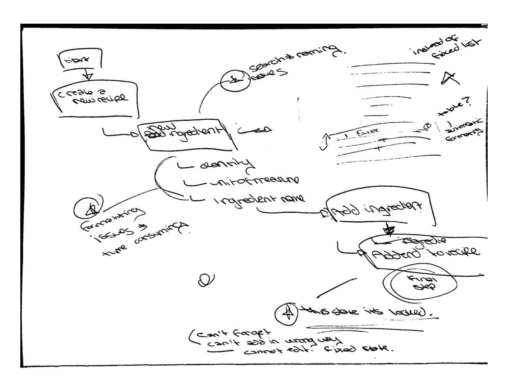
To pressure-test my own understanding, I built a recipe myself using the existing tool. It was clarifying in a way that interviews alone couldn't be. I felt the friction directly — the moment you realize you added an ingredient out of order and have to redo the entire list, the low-grade anxiety of formatting rules you can't verify until publish. That experience sharpened my empathy and shaped several of the design decisions that followed.
Design Process
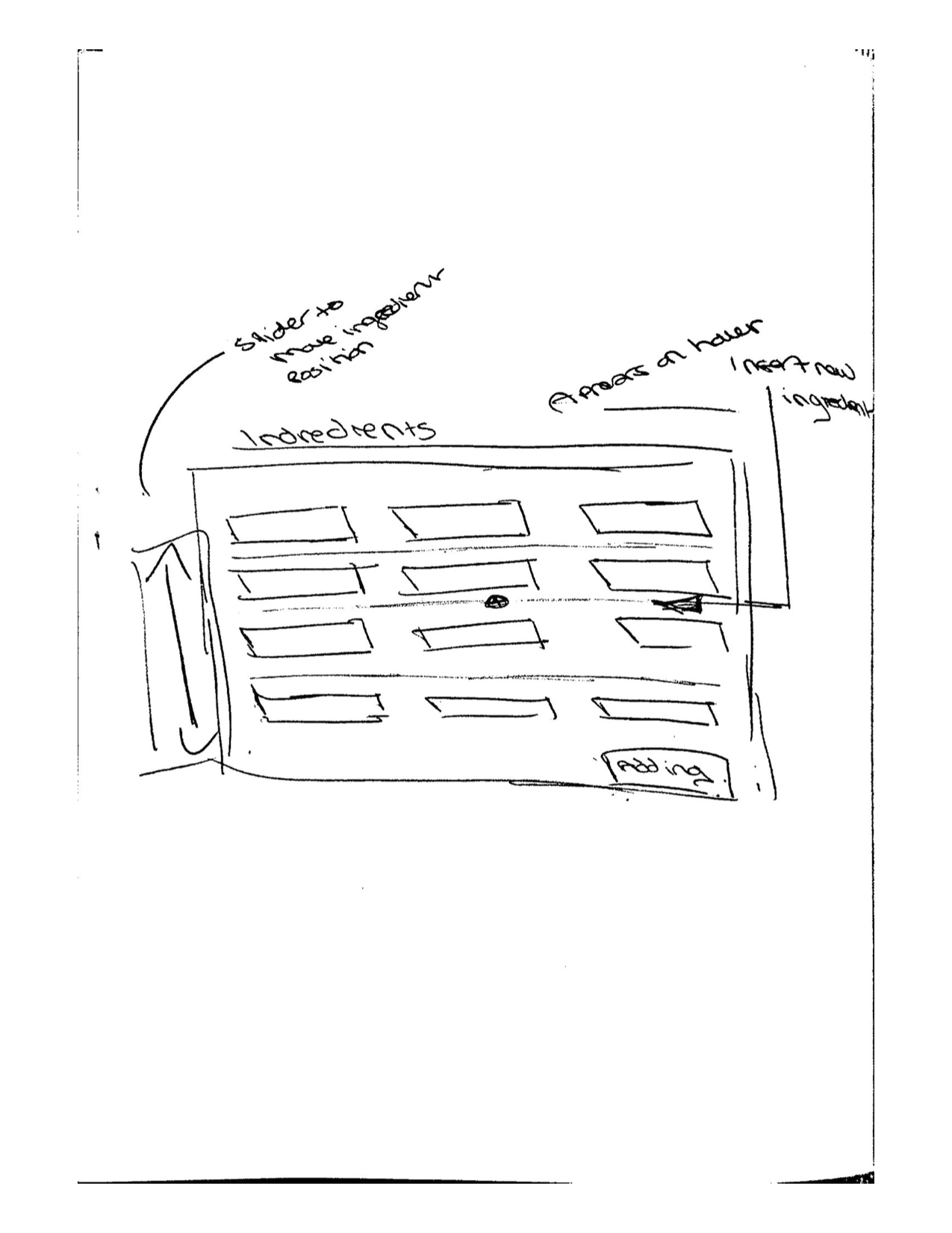
I began with low-fidelity sketches and end-to-end workflow maps, using the research findings as anchors. Rather than jumping to solutions, I spent time mapping the full journey of building a recipe — from the moment an editor opens a new CMS entry to the moment they hit publish — to identify where friction compounded and where a single well-placed change could have the most leverage.
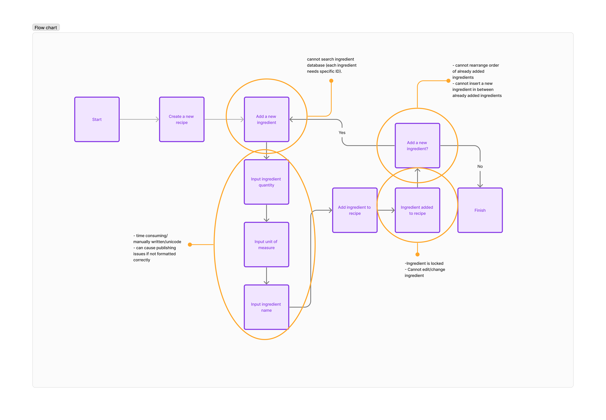
Early sketches explored several structural directions. Working closely with the design manager, we aligned on a table-based layout as the right foundation: it created clear hierarchy, made the list-based nature of ingredients visually legible, and opened up interaction patterns (insert, reorder, search) that a flat input field couldn't support.
From there I moved into interactive prototypes, which I tested with editors directly. I was looking for two things: whether the new patterns felt intuitive on first contact, and whether the efficiency gains held up under realistic conditions — a long recipe with many ingredients, mid-session edits, ingredient substitutions.
Solution
The redesign addressed each research finding directly:
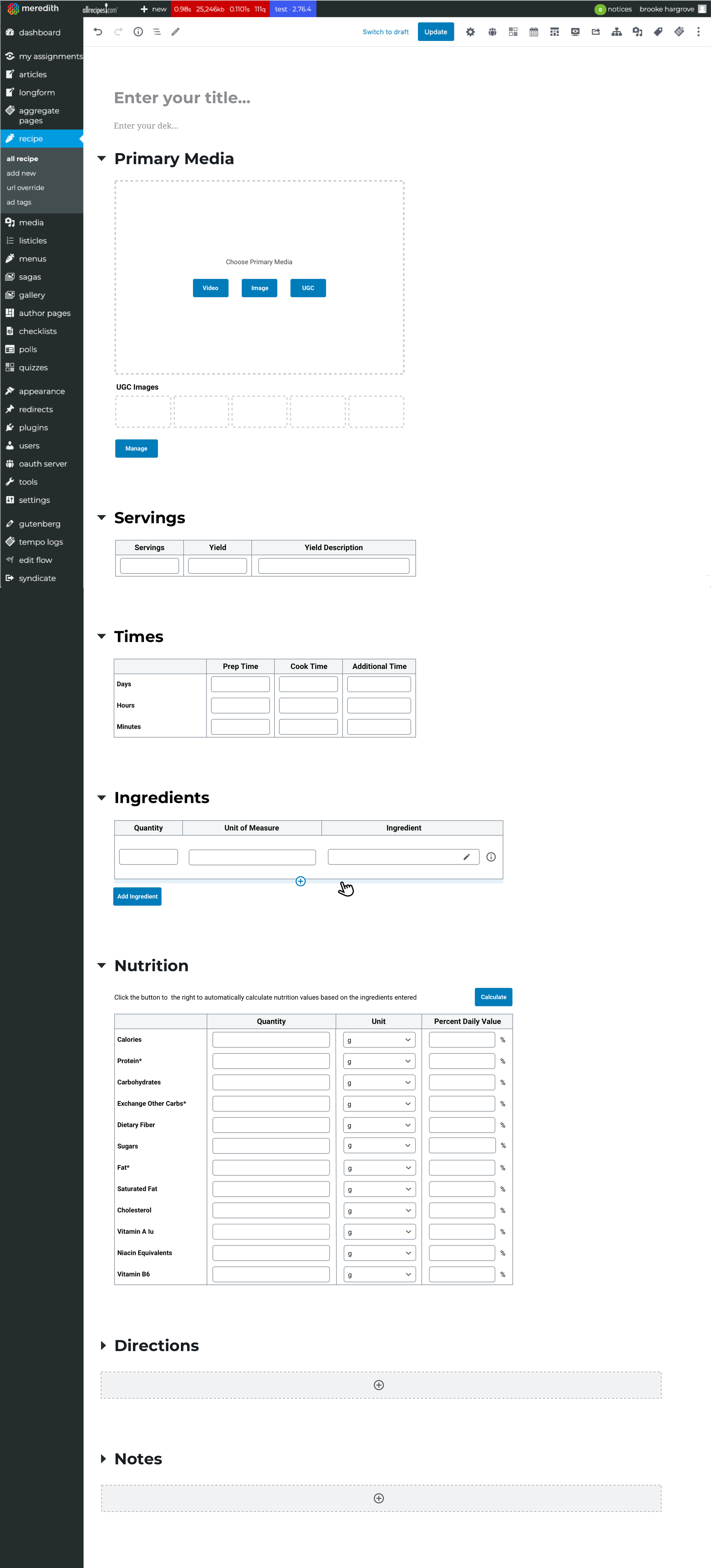
Structured ingredient table: Replaced the freeform text field with a table-based interface that handled formatting automatically. Editors could focus on content; the system handled structure.
Insert and reorder controls: Editors could now place a new ingredient anywhere in the list and drag items into a different order — without losing any existing work.
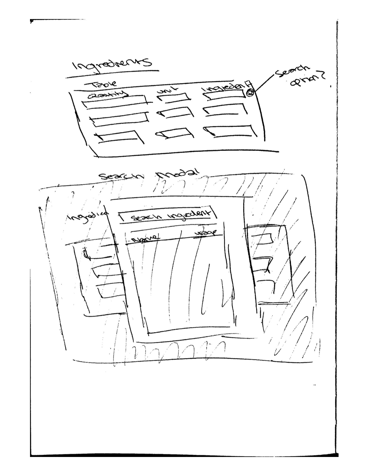
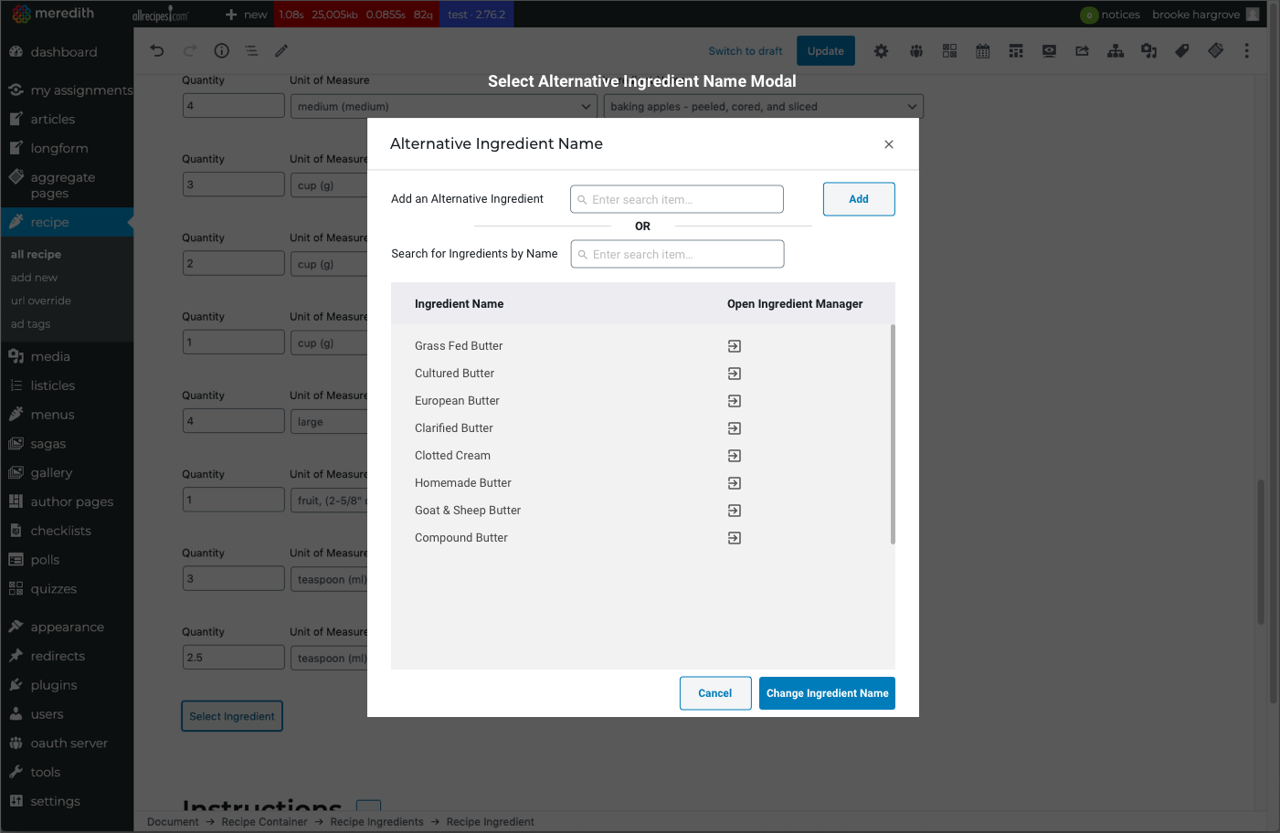
Ingredient search and modal: A dedicated search experience let editors find, select, and edit ingredients within the workflow itself, including surfacing alternatives and handling naming variations.
Automated formatting and smart defaults: The system now caught common errors before they reached publish, reducing the unicode failures that had been causing silent publishing breakdowns.
Beyond the ingredient tool, I extended the same methodology across the broader recipe workflow — redesigning the media, nutrition, servings, and timing components using the same research-grounded approach.
Prototyping & UI Design
Guided by insights from research and workflow mapping, I focused on addressing the highest-impact tasks:
Key areas targeted for improvement:
Adding new ingredients without worrying about formatting rules.
Inserting ingredients at any point in a list.
Rearranging ingredients easily with intuitive controls.
Searching for ingredients within the workflow—surfacing matches and alternatives.
Quickly selecting frequently used ingredients via smart suggestions.
Working closely with the design manager, we aligned on a table-based layout as the foundation for solving multiple usability issues at once. This structure enabled clearer hierarchy, simpler editing, and more scalable interaction patterns.
I created interactive prototypes to test with editors, validating ease of use, clarity of controls, and the intuitiveness of the redesigned workflow.
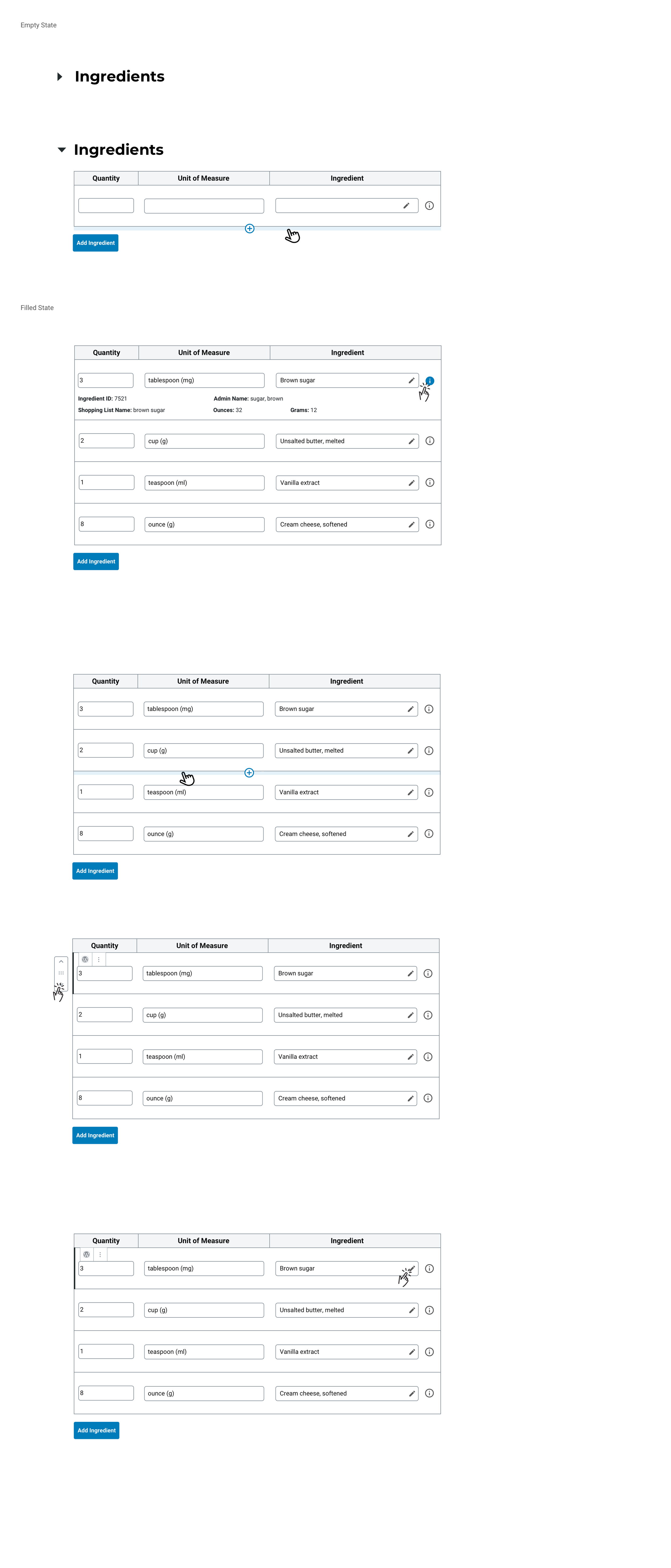
Final Designs
The final UI emphasized simplicity, clarity, and predictable interaction patterns. Key components included:
Ingredient Table: A structured interface for adding and editing ingredients without manual formatting.
Information Tooltip: Providing contextual details about each ingredient.
Insert & Rearrange Controls: Allowing editors to place items anywhere in the list and reorder them with ease.
Edit/Search Icon: Offering a streamlined way to update ingredients or search for alternatives.
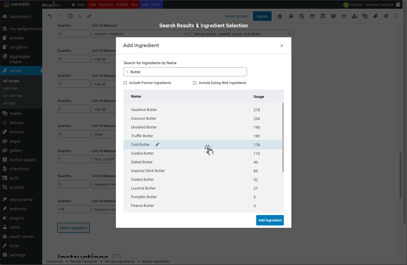
Ingredient Modal: Enabling quick ingredient search, selection, and editing in a focused workspace.
Beyond the ingredient tool, I also redesigned additional components of the broader recipe workflow—media, nutrition, servings, timing, and more—applying the same UX methodology across the ecosystem.
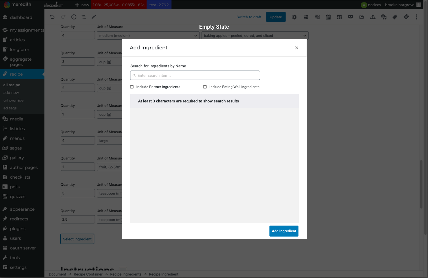
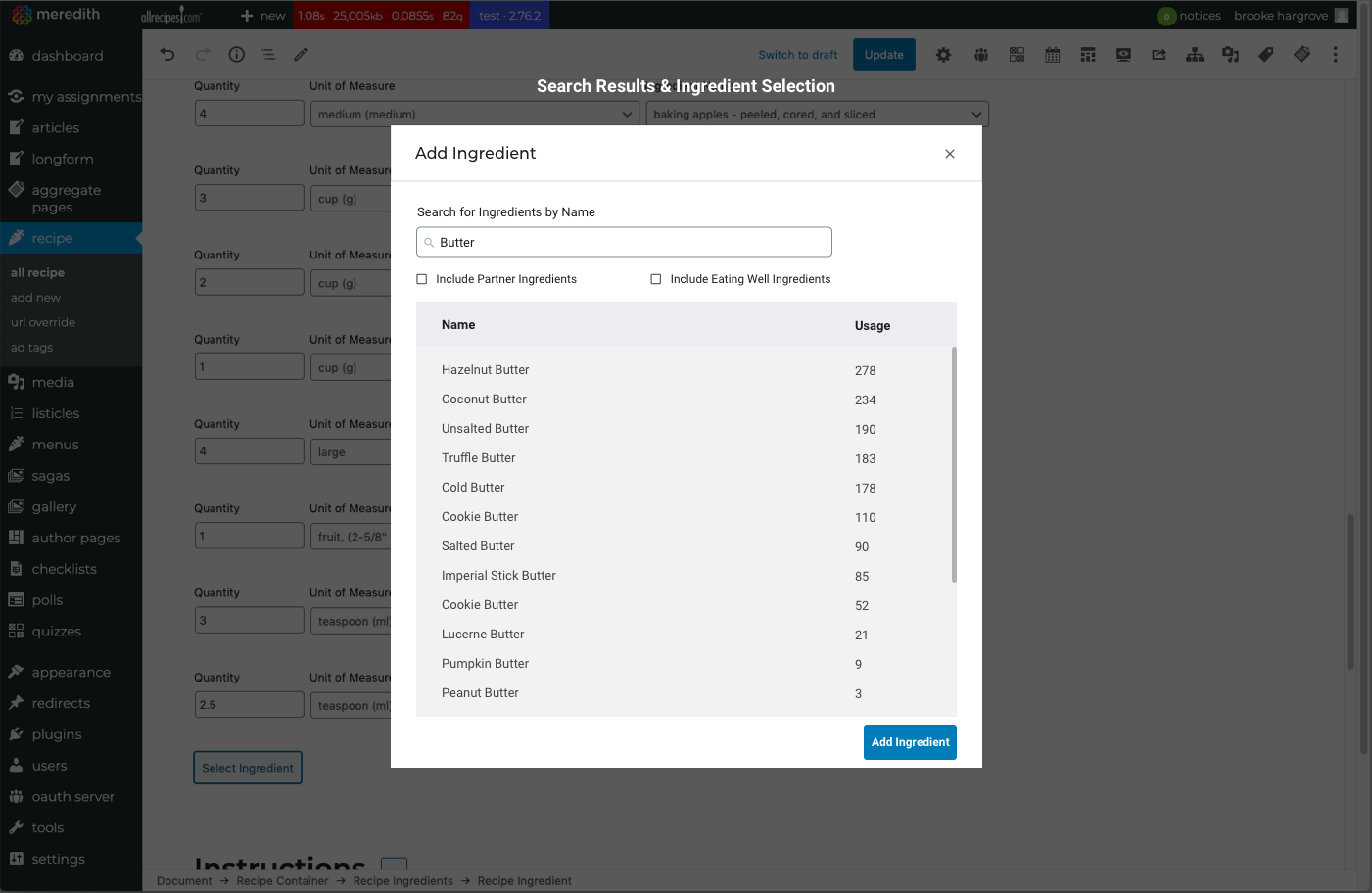
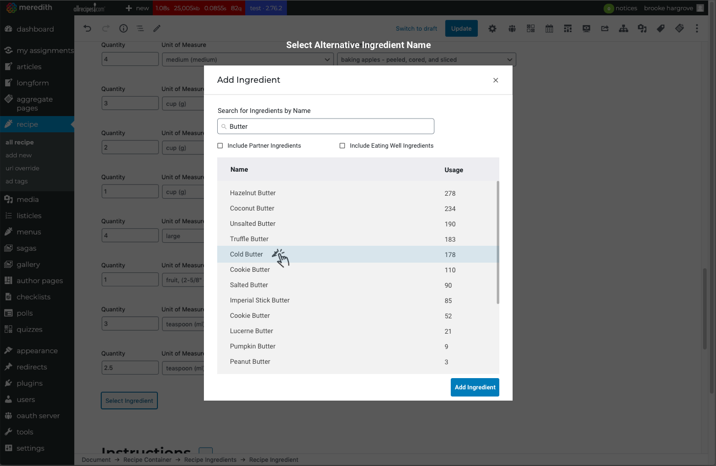
Add an Ingredient Modal Design
In addition to improving how editors added an ingredient into a list for a recipe, I designed a modal that enabled editors to quickly edit and search for (alternative) ingredients, and also edit the naming/selection of an alternative ingredient name while building their recipes.
Recipe Page
Improving how an editor adds an ingredient to a recipe was one part of a larger process and initiative of improving the usability of building a recipe at each stage. I would go on to improve and re-design each component of the 'build a recipe' workflow (primary media, nutrition, servings, time etc.) and followed a similar design process that I took when re-designing the ingredients tool.
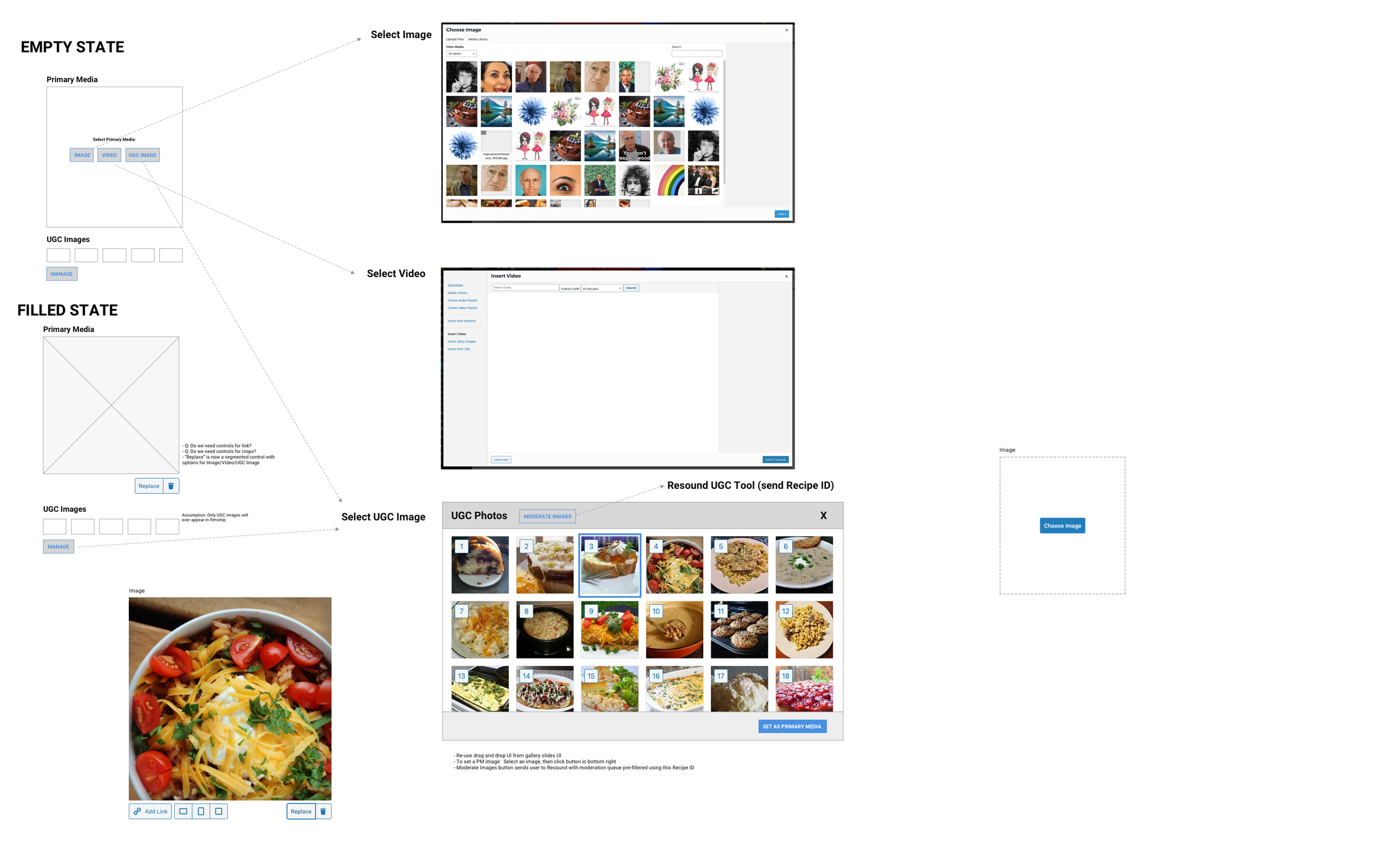
Unfilled recipe state
Replace UGC asset states
Filled recipe state
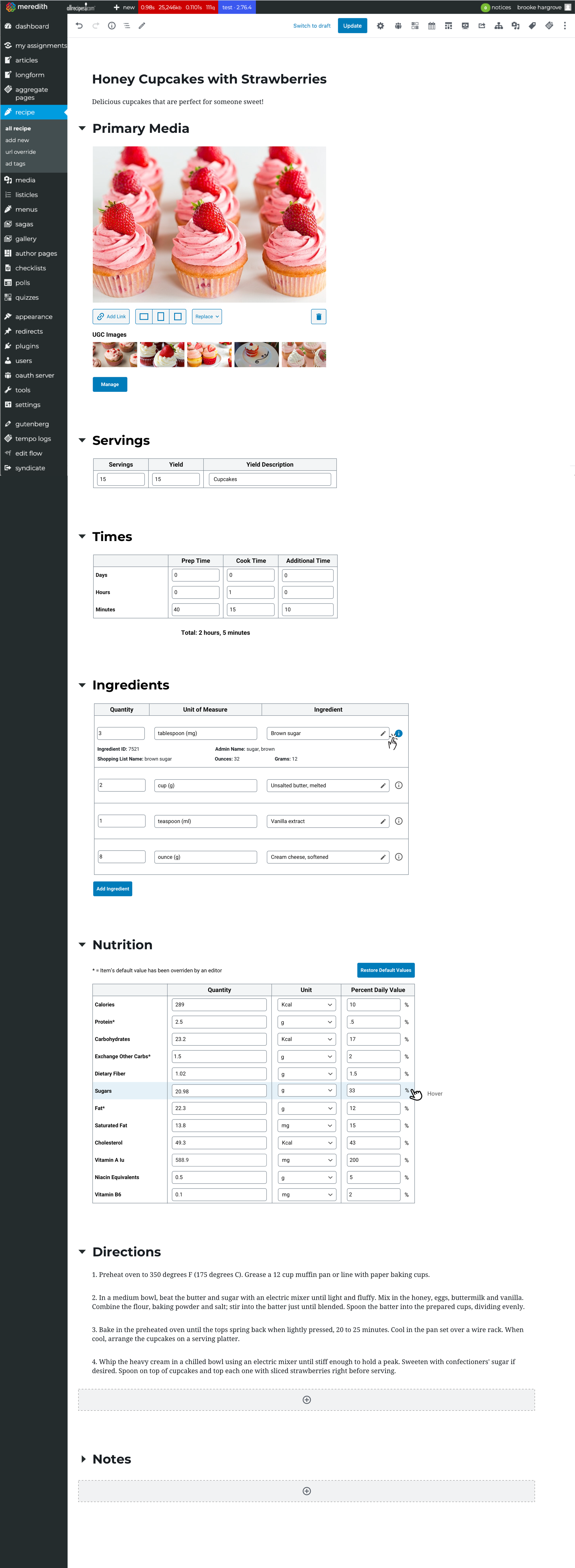
Replace UGC asset

Impact
The redesigned workflow reduced the average time to build a recipe by 40% — a gain that compounded across a team publishing hundreds of recipes a month. Publishing errors caused by manual formatting dropped significantly, removing a category of failure that had been nearly invisible until it wasn't.
The ingredient tool was adopted across multiple brand editorial teams within Meredith's portfolio, and the interaction patterns I established for it — structured tables, inline search, automated formatting enforcement — became a foundation for subsequent CMS work. What began as a scoped component redesign had grown into a system-level contribution.
Reflections
This project reinforced something I think about often: the highest-impact design work isn't always the most visible. No reader ever sees this tool. But the editors who use it every day felt the difference immediately — and that efficiency compounded across hundreds of recipes and dozens of team members over time.
It also deepened my appreciation for the value of building a tool, which was a new design experience for me. Doing a recipe build in the legacy tool wasn't just a research exercise — it gave me a different kind of understanding than interviews alone could. Feeling the friction directly, rather than hearing about it, shaped how I prioritized the design work that followed. That instinct to get close to the problem — not just observe it — has stayed with me.