Lead Product Designer
Led the end-to-end redesign of Artbinder's homepage — rethinking information architecture, elevating the brand's visual language, and delivering a conversion-focused experience for a platform serving some of the world's most prestigious art institutions.
Overview
Role: Founding Product Designer Focus: Homepage redesign, information architecture, brand elevation, conversion
Artbinder is a digital inventory management platform used by artists, gallerists, and collectors to organize and share artwork across devices. Its client list includes some of the most prestigious galleries globally — which made the gap between the product's actual quality and its homepage's first impression a real business problem.
As the sole product designer, I led a complete redesign of the Artbinder homepage from discovery through delivery, covering desktop, tablet, and mobile. The goals were clear: fix a confusing information architecture, close the gap between the brand's premium positioning and its digital presence, and give prospective customers a reason to stay long enough to understand what they were looking at.
Problem
Artbinder operates at the intersection of technology and the fine art world, serving some of the most prestigious galleries globally. However, the existing homepage failed to reflect this positioning.
Stakeholders identified two critical issues:
Brand misalignment: The visual design did not convey the premium, sophisticated nature of the company or its clientele.
Poor usability and clarity: Users struggled to navigate the site and understand core offerings, with pricing and product value being particularly unclear.
This disconnect resulted in friction during onboarding and weakened first impressions for prospective customers.
Website Before: Key Issues Identified
A detailed review of the existing homepage revealed several structural and usability challenges:
Overly dark, heavy UI that felt unapproachable
Visual design that did not align with the brand’s premium positioning
Confusing navigation patterns
Critical information (notably pricing and services) buried within nested sections
High cognitive load caused by poor hierarchy and content organization

Content Audit & Information Architecture
Previous State
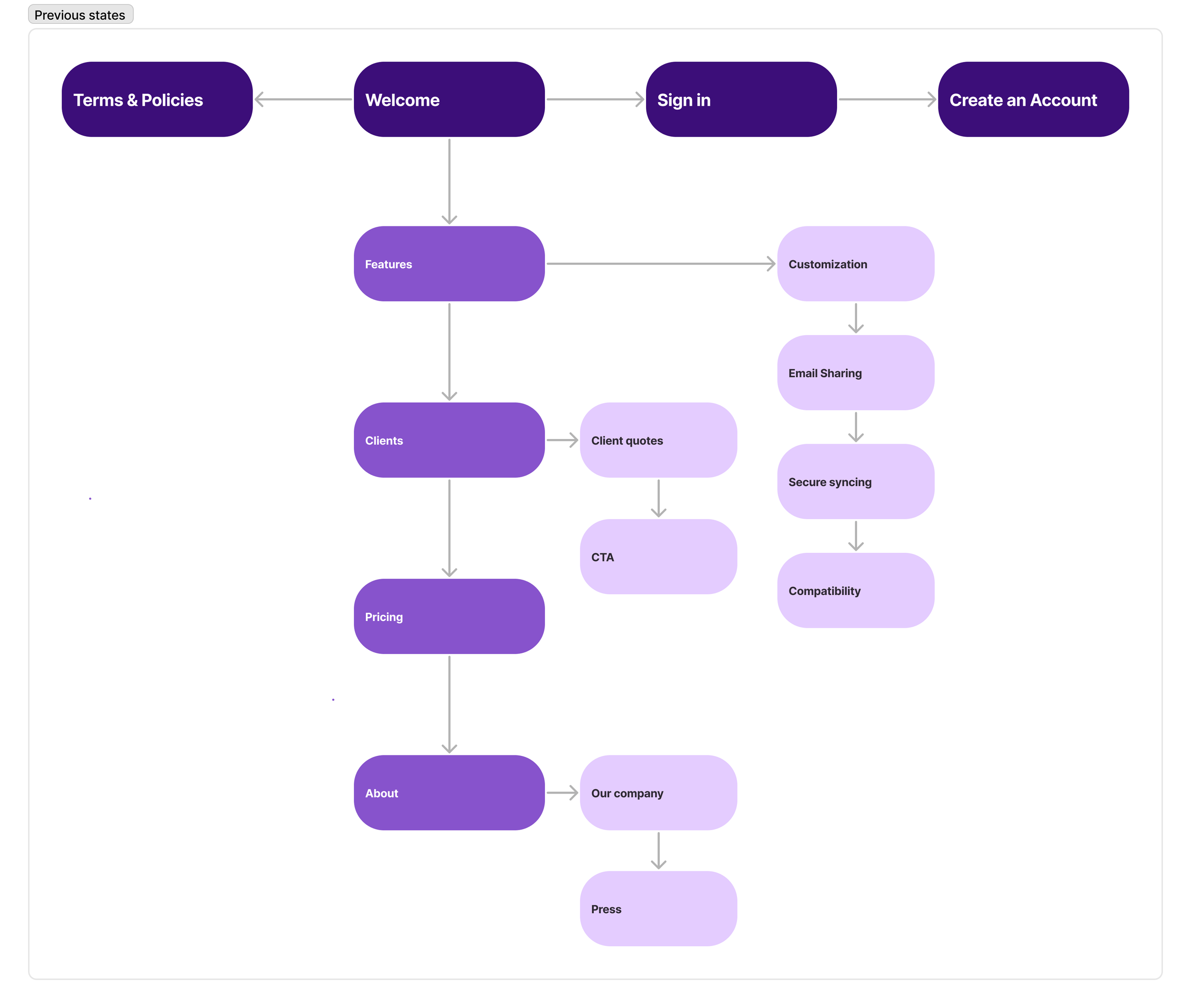
I began by mapping the existing information architecture. The homepage relied heavily on nested content sections, requiring users to click into individual areas to uncover essential information. As a result, key details about the product and its benefits were easily missed, and the overall content hierarchy lacked a logical flow.
This structure placed unnecessary decision-making on the user and obscured Artbinder’s core value.
Updated State
Based on usability findings and internal discussions, it became clear that a full structural reorganization was required.
I collaborated closely with stakeholders to define a clearer content hierarchy, then redesigned the homepage to:
Surface all essential information on a single, scannable landing page
Eliminate unnecessary nesting
Establish a clear narrative from value proposition → features → social proof → calls to action
The result was a layout that feels intentional, intuitive, and immediately legible, allowing users to understand the product and next steps within moments of landing on the site.

Wireframes
With the revised content structure in place, I created wireframes to explore layout and hierarchy across breakpoints. The primary goal was to balance:
Business objectives: driving sign-ups and inquiries
User needs: quickly understanding what Artbinder does, who it’s for, and why it’s valuable
Wireframes focused on clarity, pacing, and visual rhythm, ensuring content felt digestible rather than overwhelming.

Final Design
The final homepage design delivers a significantly improved user experience through both structure and aesthetics.
Key outcomes include:
A brighter, more refined visual language aligned with Artbinder’s premium brand
A simplified, highly scannable content structure
Clear articulation of the platform’s offerings and differentiators
Prominent social proof showcasing trusted gallery partners
Strong, well-placed calls to action
Together, these changes created a homepage that not only feels elevated and credible, but also functions as an effective acquisition and storytelling tool for the business.

Solution
The redesigned homepage consolidated a fragmented, nested content structure into a single scannable page with a clear narrative arc: value proposition, platform capabilities, social proof, call to action. I redesigned the visual language to better reflect Artbinder's premium clientele — lighter, more refined, with stronger typographic hierarchy and a more considered use of whitespace. Every layout decision was made in service of a single goal: a prospective gallery client should be able to land on this page and immediately understand what Artbinder is, who it's for, and why it's worth their time.
Outcomes & Impact
While formal analytics were limited at the time of launch, post-release signals and stakeholder feedback indicated meaningful improvements across both user experience and business outcomes:
Improved user comprehension: Stakeholders reported fewer follow-up questions around pricing and core offerings after launch.
Stronger engagement: Users spent more time on the homepage and progressed more clearly to primary calls to action (sign-up and contact).
Increased lead quality: Sales and account teams noted more informed inbound inquiries, suggesting clearer expectation-setting through the redesigned homepage.
Elevated brand perception: The new design better reflected the sophistication of Artbinder’s gallery and collector clientele, strengthening trust and credibility at first touch.
Reflections
This project reinforced the importance of clear information architecture as a conversion tool, not just a usability consideration. Even well-designed products can fail to convert if their value isn’t immediately legible.
Key takeaways:
Clarity outperforms cleverness: Removing nested content and surfacing essential information dramatically improved comprehension and flow.
Brand and usability are inseparable: Elevating the visual design without fixing structural issues would not have solved the core problems.
Single-page narratives reduce friction: Treating the homepage as a guided story—rather than a collection of sections—helped users understand what Artbinder offers and why it matters within seconds.
Going forward I'd prioritize building in quantitative measurement from the start — not because the qualitative signals weren't meaningful, but because having conversion data would have allowed for faster, more confident iteration on the moments that mattered most.