Lead Product Designer
Led the end-to-end redesign of Health.com and creation of its digital platform guide — unifying a major consumer brand's print and digital identities within Meredith's large-scale design system, and setting the standard for 40+ brand migrations that followed.
Overview
Role: Lead Product Designer Focus: Brand redesign, design systems, cross-functional stakeholder alignment
In 2018, Meredith Corporation completed its acquisition of Time Inc. — one of the largest media mergers in recent history — bringing together a portfolio of over 40 consumer brands under one roof. With that scale came a significant design challenge: every legacy Time Inc. brand needed to be migrated into a unified digital design system, rebuilt from the ground up to work within a shared, white-label framework built on atomic design principles.
Health.com was selected as one of the first brands to undergo this transformation. The stakes were high — not just for the Health brand itself, but because the decisions made here would establish the process, standards, and expectations for every migration that followed.
I was the lead product designer on the project, responsible for driving the redesign from discovery through delivery: defining creative direction, building a comprehensive platform guide, and aligning a cross-functional team of editors, developers, and senior design leadership around a shared vision.
Problem
Health.com had two distinct but interconnected problems.
The first was a brand misalignment that had quietly widened over time. The Health print magazine had recently evolved its editorial aesthetic — sharper typography, a more sophisticated visual language, a cleaner hierarchy. The digital experience hadn't kept pace. Visiting Health.com felt like visiting an older version of the brand: inconsistent type usage, a color system that didn't reflect the print identity, and layouts that hadn't been meaningfully reconsidered in years.
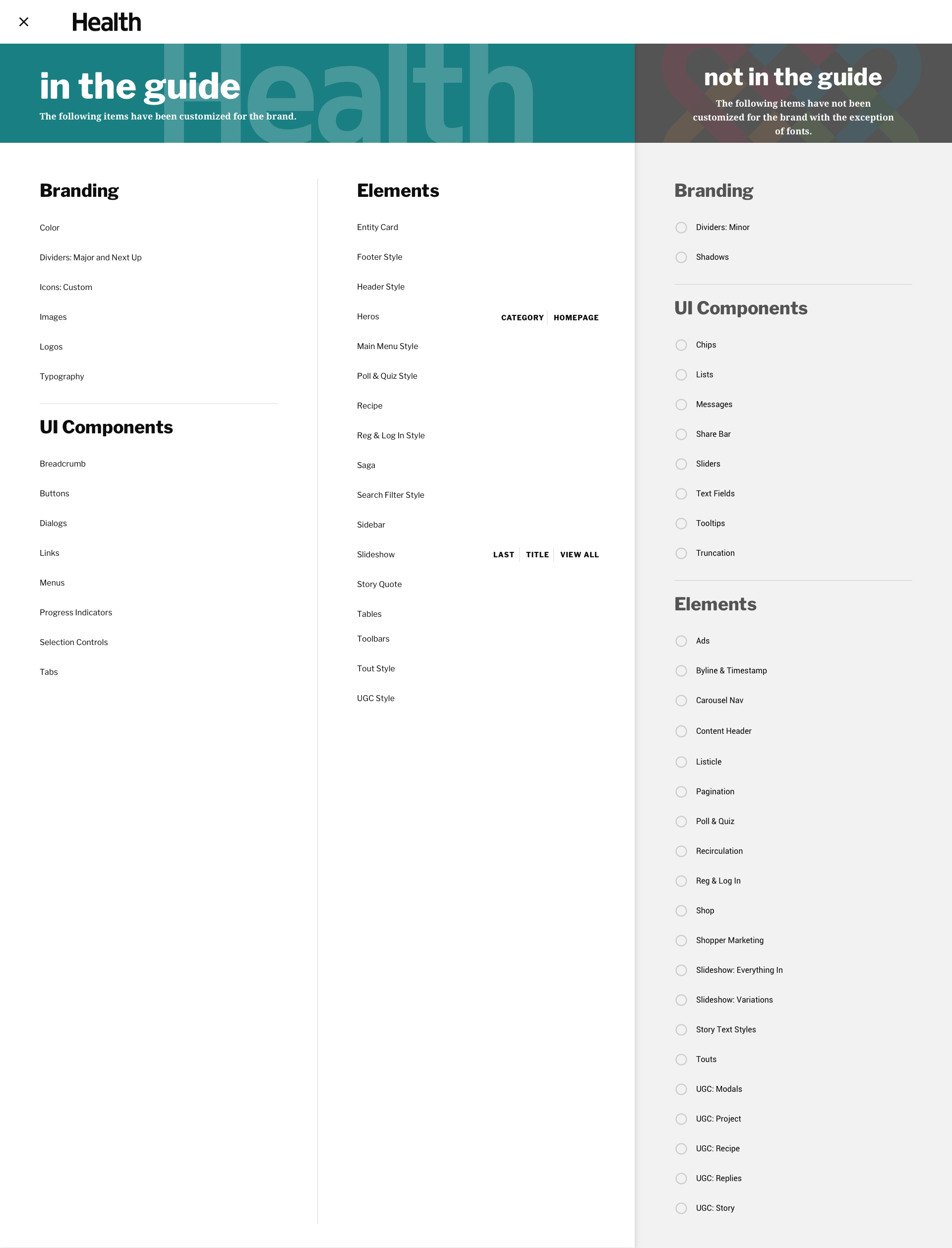
The second problem was structural. Migrating Health.com into Meredith's shared design system wasn't just a visual refresh — it required building a comprehensive platform guide documenting every UI component, template, pattern, and visual rule. This guide would need to be detailed enough for developers to implement with confidence, flexible enough to express the Health brand distinctly within a white-label framework, and rigorous enough to serve as a model for the brands that came after.
Both problems had to be solved together, in sequence, without the luxury of solving one cleanly before starting the other.
Process
1. Research & Audit
I led a full audit of the existing Health.com experience alongside current and archival print materials. My goal was to identify the core attributes of the print brand—its tone, hierarchy, and typographic voice—and determine how these could translate effectively into a digital environment.
This research highlighted key gaps in visual alignment and guided the framework for the redesign.
2. Stakeholder Alignment
As lead designer, I facilitated workshops and review sessions with editors, product managers, and the VP of Design to establish the creative direction and priorities. I defined how closely the digital experience should mirror the print identity, balancing editorial fidelity with digital usability.
Through these discussions, I aligned cross-functional teams around a shared vision for Health.com’s new direction and created a clear roadmap for design milestones and delivery.
3. Visual Exploration & Direction Setting
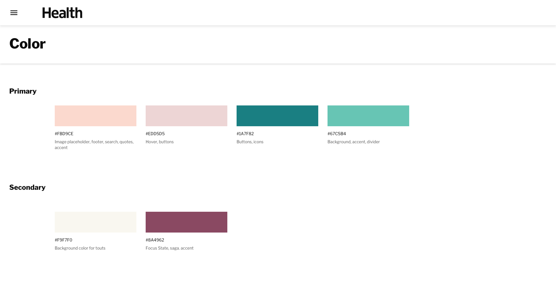
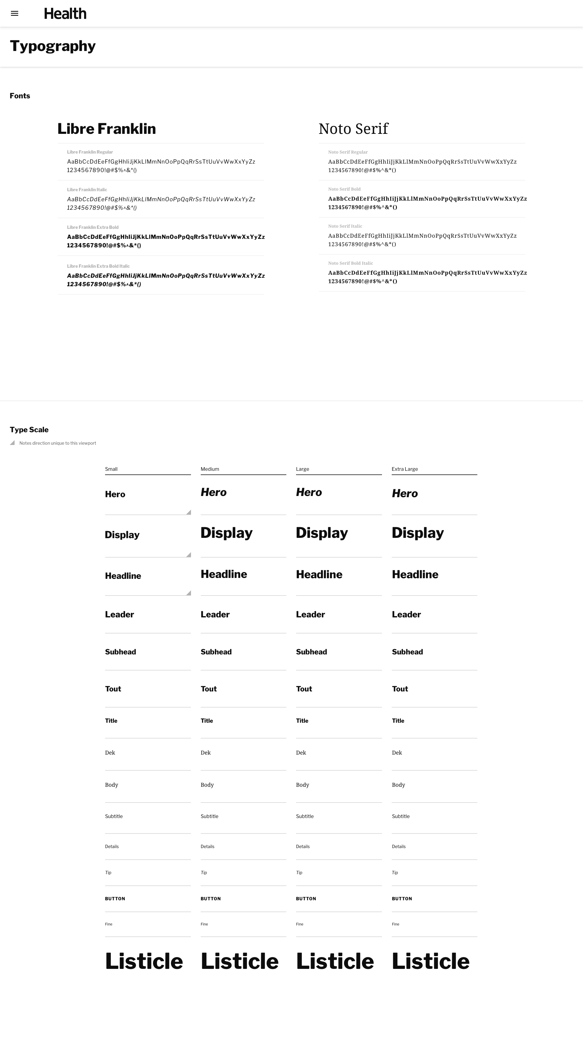
I led the visual exploration phase, developing multiple style guides that showcased potential color palettes, typographic systems, and interface components. These explorations enabled focused discussions around visual hierarchy, tone, and brand integrity.
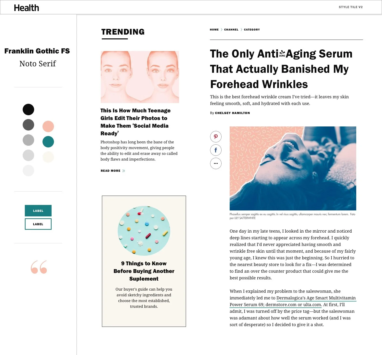
Across eight rounds of iteration and review, I guided stakeholders through each design decision—culminating in the selection of Libre Franklin and Noto Serif as the core typefaces for their balance of editorial sophistication and digital clarity. This established the foundation for the redesigned visual system.
4. Platform Guide Development
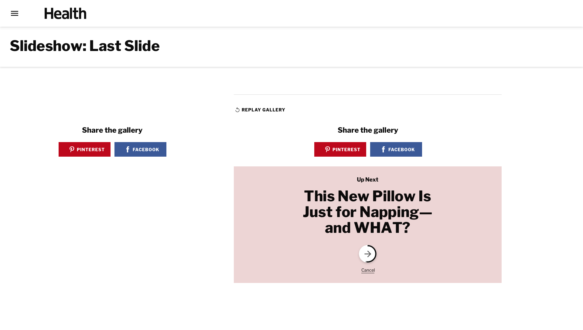
Once the visual direction was approved, I led the creation of Health’s comprehensive platform guide. This included documenting every UI component, state, and pattern—buttons, forms, grids, navigation, and editorial modules—within a modular atomic design framework.
I collaborated closely with developers to ensure design fidelity, scalability, and ease of implementation, setting the blueprint for future brand migrations.
Research & Audit
I began with a full audit of the existing Health.com experience — working through every major content type, page template, and UI pattern — alongside an immersion in the print magazine's current and archival issues. My goal wasn't just to catalog what existed, but to understand the gap: where had the digital experience diverged from the brand's editorial identity, and what was driving that divergence?
The audit surfaced several specific misalignments. The digital typographic system had no meaningful relationship to the print masthead — the fonts were different, the hierarchy didn't reflect the magazine's editorial tone, and type sizing across templates was inconsistent. Color usage on the site was similarly adrift: the palette wasn't wrong exactly, but it lacked the intentionality of the refreshed print identity. And layout patterns — particularly on article and category pages — prioritized ad placement over editorial experience in ways that had degraded the reading experience over time.
These findings gave me a clear brief: the redesign needed to close the gap between print and digital not by copying the magazine, but by translating its editorial sensibility into a digital-native system.
Stakeholder Alignment
With the audit complete, I facilitated a series of workshops and working sessions with the editorial team, product managers, and the VP of Design. These sessions served two purposes: building alignment around creative direction, and surfacing the editorial requirements that couldn't be compromised.
Editors had strong opinions — they always do at brands with this kind of editorial heritage — and those opinions were worth taking seriously. The conversations pushed me to be more precise about design decisions I might otherwise have moved through quickly. Why this typeface and not that one? What does this layout choice say about how we value content versus commerce? Those are the right questions to be asking, and stakeholder pressure made me answer them more rigorously.
By the end of this phase, I had alignment on a clear design direction and a documented set of editorial priorities that would guide every decision in the build phase.
Visual Exploration & Direction
I led the visual exploration across multiple style directions — developing full style guides for each that covered typography, color, component hierarchy, and editorial modules. These weren't mood boards; they were functional enough to pressure-test real content and surface implementation questions early.
Over eight rounds of iteration and stakeholder review, the direction refined. The most significant decision was typeface selection. After evaluating a range of options against the Health brand's dual requirements — editorial sophistication and digital legibility across devices and screen sizes — I landed on Libre Franklin and Noto Serif as the core pairing. Libre Franklin brought the clean, modern structure the brand needed at the navigation and utility level; Noto Serif introduced the editorial warmth and authority the magazine had long carried in print. Together they created a typographic system that felt distinctly Health without feeling out of place in a digital context.
Final version of the Health Style Guide
Platform Guide Development
With the visual direction approved, I led the creation of Health's comprehensive platform guide — the single source of truth for the brand's digital identity.
The guide documented every UI component in its full range of states: buttons, forms, navigation patterns, article templates, category pages, editorial modules, grid systems, and responsive breakpoints. Each component was built within Meredith's atomic design framework, meaning it could be assembled and reassembled across contexts without breaking the system's internal logic.
I worked closely with the development team throughout this phase — not handing off at the end, but building alongside them. That collaboration surfaced implementation constraints early enough to solve them in design rather than in code, and it meant the final guide was something developers could actually build from, not just reference.
Impact
Set the design and process standard for all 40+ brand migrations that followed within Meredith's post-acquisition portfolio
Closed the print-to-digital gap for the Health brand, delivering a modern, cohesive consumer experience that reflected the magazine's current editorial identity
Established scalable design documentation that accelerated development timelines across subsequent redesigns — including Parents, Travel & Leisure, and Martha Stewart
Became a reference framework that other lead designers used as their starting point for high-profile migrations
Reflections
Looking back, what made this project successful wasn't any single design decision — it was the discipline of solving both problems simultaneously without letting either one slip. The brand work and the systems work had to reinforce each other: a beautiful visual direction that couldn't be documented and implemented at scale would have failed, and a rigorous platform guide built on a weak creative foundation would have produced something forgettable.
It also taught me something about working at the intersection of editorial and product. Editors think about brand differently than product teams do — with more feeling, more historical context, more attachment. Learning to hold space for that perspective while still making clear design recommendations made me a more effective designer and a more effective collaborator.
That skill — navigating opinionated stakeholders without losing the integrity of the design — turned out to be one of the most transferable things I took from Meredith into everything that followed.
The project’s success elevated the Health.com platform guide into a reference framework for other high-profile redesigns across Meredith, including Parents, Travel & Leisure, and Martha Stewart, positioning it as a model for how brand modernization could be executed efficiently and effectively at scale.