Lead UX/UI Designer.
Article bylines at Meredith were a dead end. No clickable author names, no path to explore a writer's body of work, no way for readers to stay. I turned that dead end into a destination — a scalable Author Page system deployed across 25+ national media brands.
Overview
As lead UX designer, I owned this project from problem definition through engineering handoff — running discovery, framing requirements, and designing across four responsive breakpoints. The problem didn't come from a product brief. It surfaced during usability testing the UX researcher was conducting on the CMS, where a recurring gap emerged: author names in article bylines weren't clickable, cutting off reader curiosity at exactly the moment engagement could deepen. I brought that insight to the product team, got it prioritized, and built the solution.
Problem
Meredith's article bylines linked to nothing. Readers who wanted to explore a writer's other work had no path to follow — which meant shorter sessions, weaker editorial voice, and a missed opportunity to build the kind of author-reader relationships that drive loyalty. The fix wasn't complicated. It just hadn't been built yet.
Process
Discovery
The problem emerged organically during CMS usability interviews with editors. After the product team prioritized it, I was given general guidelines, however I was tasked with defining and brainstorming specific requirements and vision for the author page experience.
Since neither editors nor product stakeholders provided detailed specifications, I initiated exploratory discussions and framed key design questions:
What user goals should this page fulfill beyond article discovery?
How might this feature encourage deeper engagement?
Which elements from our design system could be reused or reimagined?
What patterns do competitor author pages use effectively?
These questions guided early ideation and positioned the project for strategic impact rather than a narrow feature build.
Exploration & Ideation
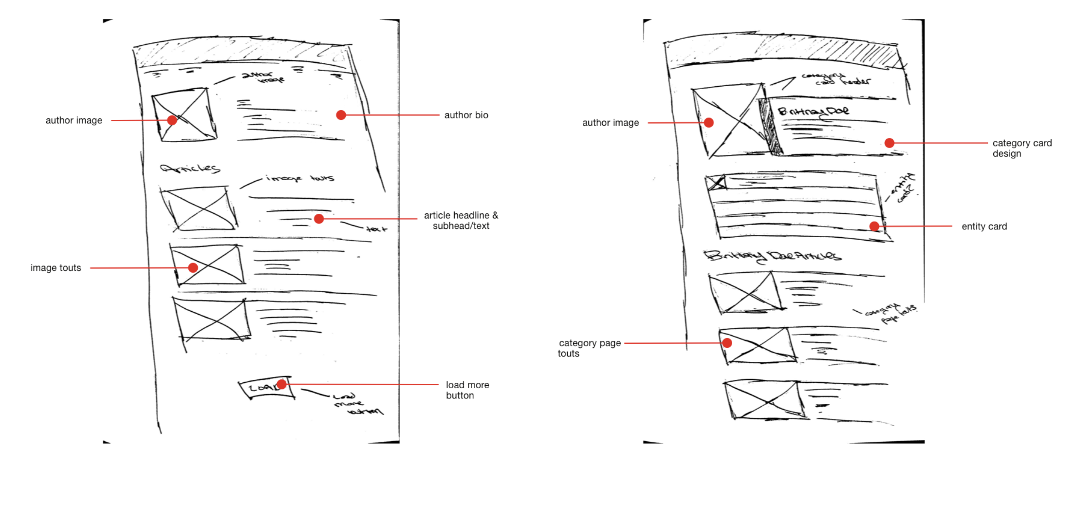
I began with low-fidelity sketches exploring multiple layout concepts.
Concept A featured a simple layout: author photo, bio, and a chronological list of articles.
Concept B explored system reuse, incorporating existing design system components (e.g., category cards and entity cards) to test modular flexibility.
After discussions with the design manager, Concept B provided a promising structure but required refinement to maintain visual balance and hierarchy.
Concept A
Concept B
Low-Fidelity Wireframes
I translated sketches into wireframes across four responsive breakpoints (XL, L, M, S).
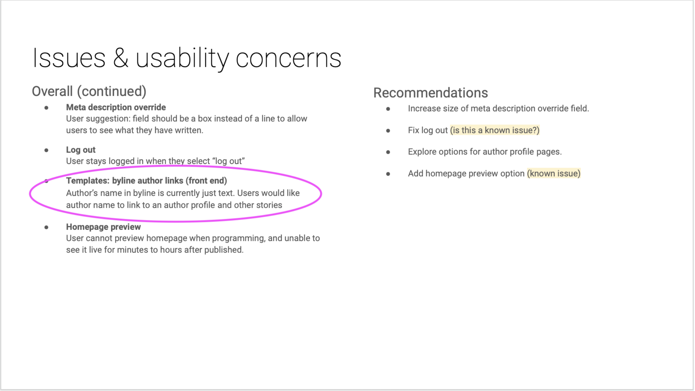
Initial stakeholder feedback highlighted two key opportunities:
Simplify the layout by removing the bulky entity card.
Introduce functionality for editors to pin featured articles to the top of their pages.
Iteration & Redesign
After a design review with stakeholders, the general consensus was that the reuse of the entity table design was a strong direction, but that it visually felt clunky and off balance. An additional pain point that was communicated by editors during this stage is that they'd like to have the ability to highlight articles that were noteworthy in some way (by views/popularity, importance, etc.) and for those articles to remain pinned at the top of their author pages.
I revisited the visual hierarchy, drawing inspiration from social media profile layouts where bios, avatars, and social links are presented intuitively. Ultimately I:
Moved social icons into the bio card for improved cohesion.
Added the author’s title and location for richer context.
Introduced a “pin” icon to mark featured articles — improving editorial control and personalization.
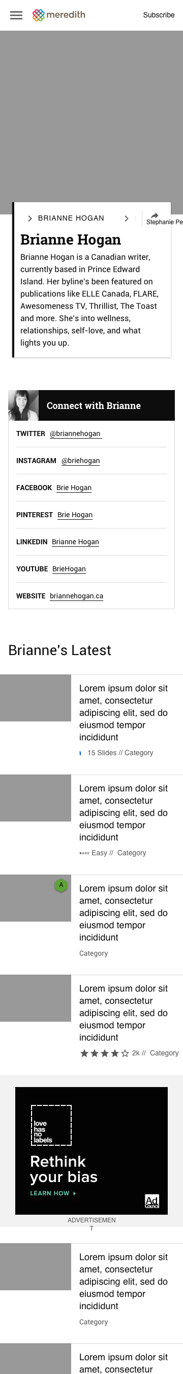
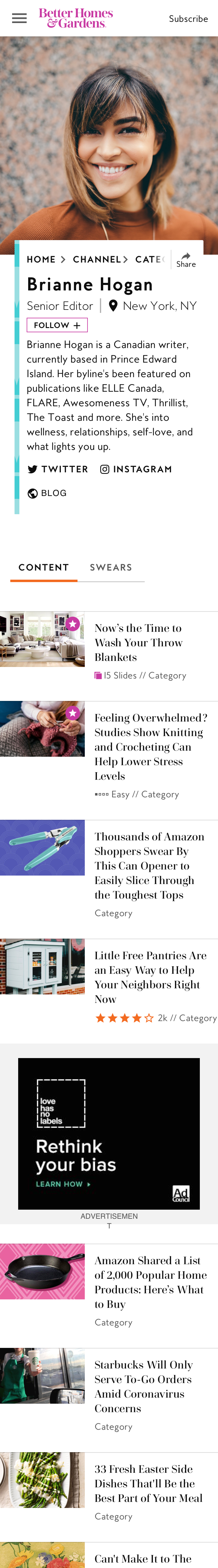
On mobile, I adjusted this feature by using a star icon overlay on article images to preserve clarity in tighter layouts. This design was approved unanimously by stakeholders.
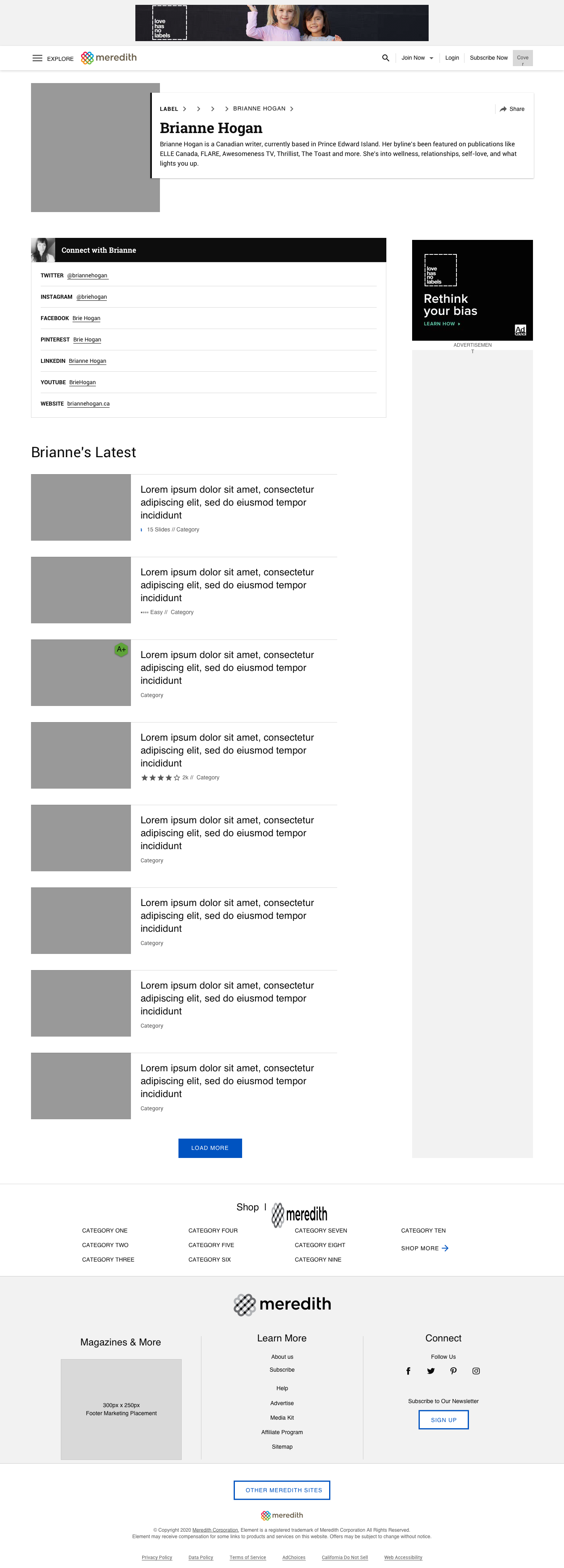
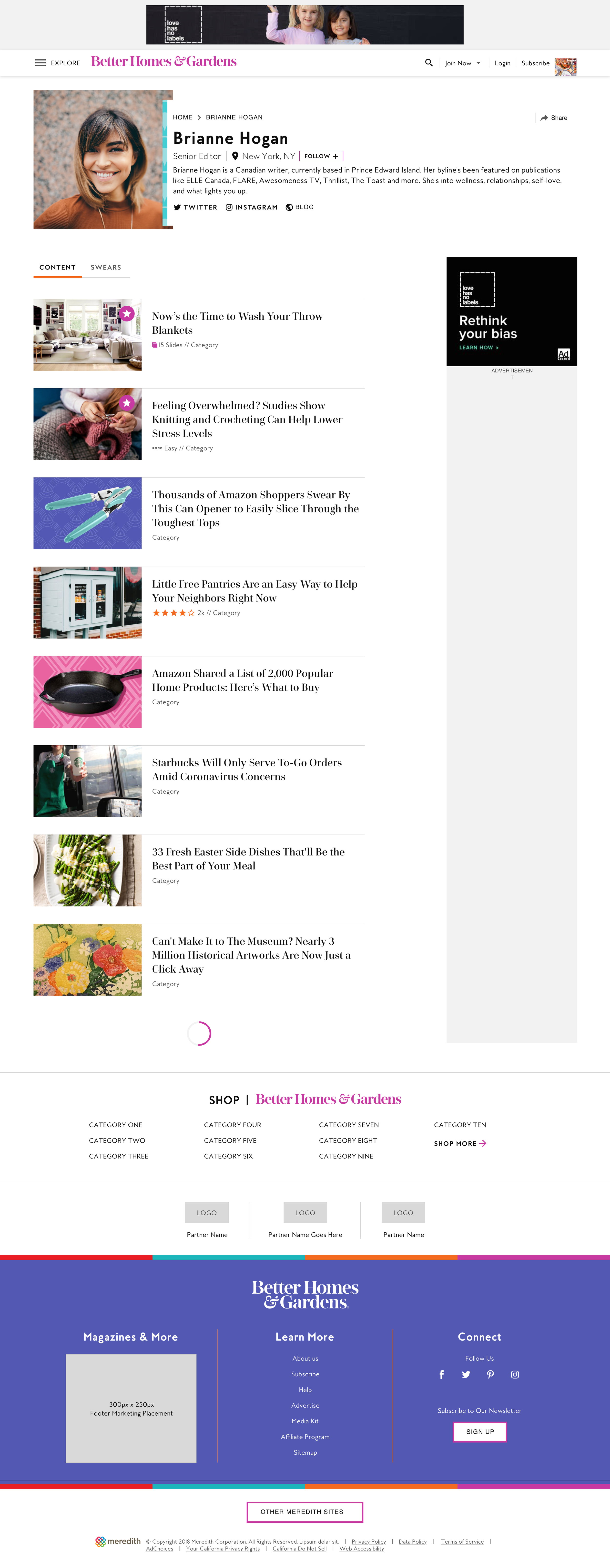
High-Fidelity Designs
After final review and stakeholder approval, I skinned the final design in a Meredith brand style to demonstrate scalability and brand adaptability. The responsive Author Page system was then delivered to engineering for implementation and QA across Meredith’s portfolio.
XL (desktop) breakpoint
S (mobile) breakpoint
Impact & Learnings
The author pages launched across pilot brands and were adopted as a design system pattern, making it reusable across every brand in the portfolio. Editors described them as a simple but powerful way to amplify their writers' voices. On the product side, pilot brands saw measurable improvements in time on page, scroll depth, and cross-article navigation — readers were following authors instead of bouncing.
What this project reinforced for me: the most valuable thing I brought wasn't the design. It was taking a loosely defined problem and building the structure and vision needed to move it forward. The initiative to define the work was just as important as the work itself.