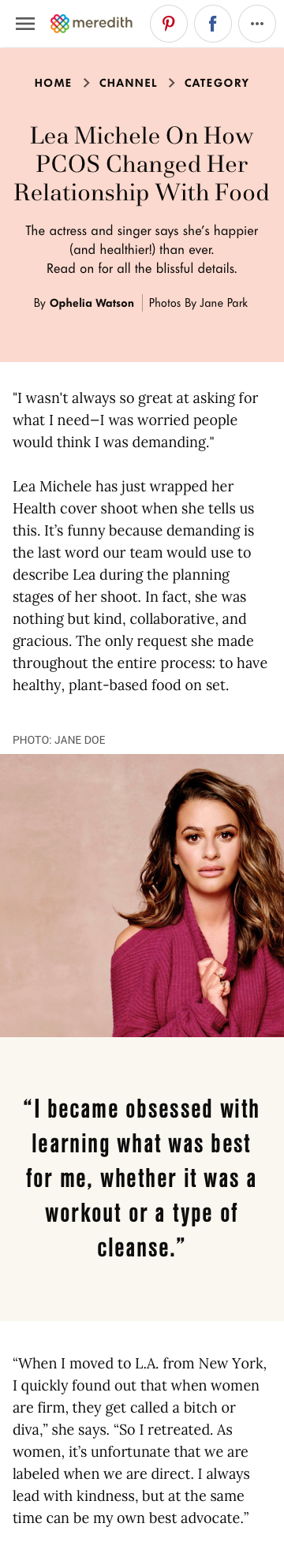
Product Designer
Designed a responsive, scalable long-form article template used across 30+ Meredith brands, balancing a unified backend structure with flexible UI patterns that supported each brand’s unique identity.
Overview
Role: Product Designer
Focus: My focus was to define a scalable, platform-wide article experience that balanced system-wide consistency with the flexibility required for 30+ brands to express their unique identities.
With the migration of all Time Inc. brands onto a unified backend platform, our team was responsible for developing a comprehensive suite of white-label templates for nearly every page type. These templates needed to support more than 30 Meredith brands, offering a single scalable structure while remaining flexible enough to accommodate each brand’s unique voice and visual identity.
For this initiative, I designed the long-form article template—a core content experience used across all Meredith properties. I delivered fully responsive designs for desktop, tablet, and mobile, ensuring consistency, adaptability, and brand-appropriate customization across the entire portfolio.
Problem
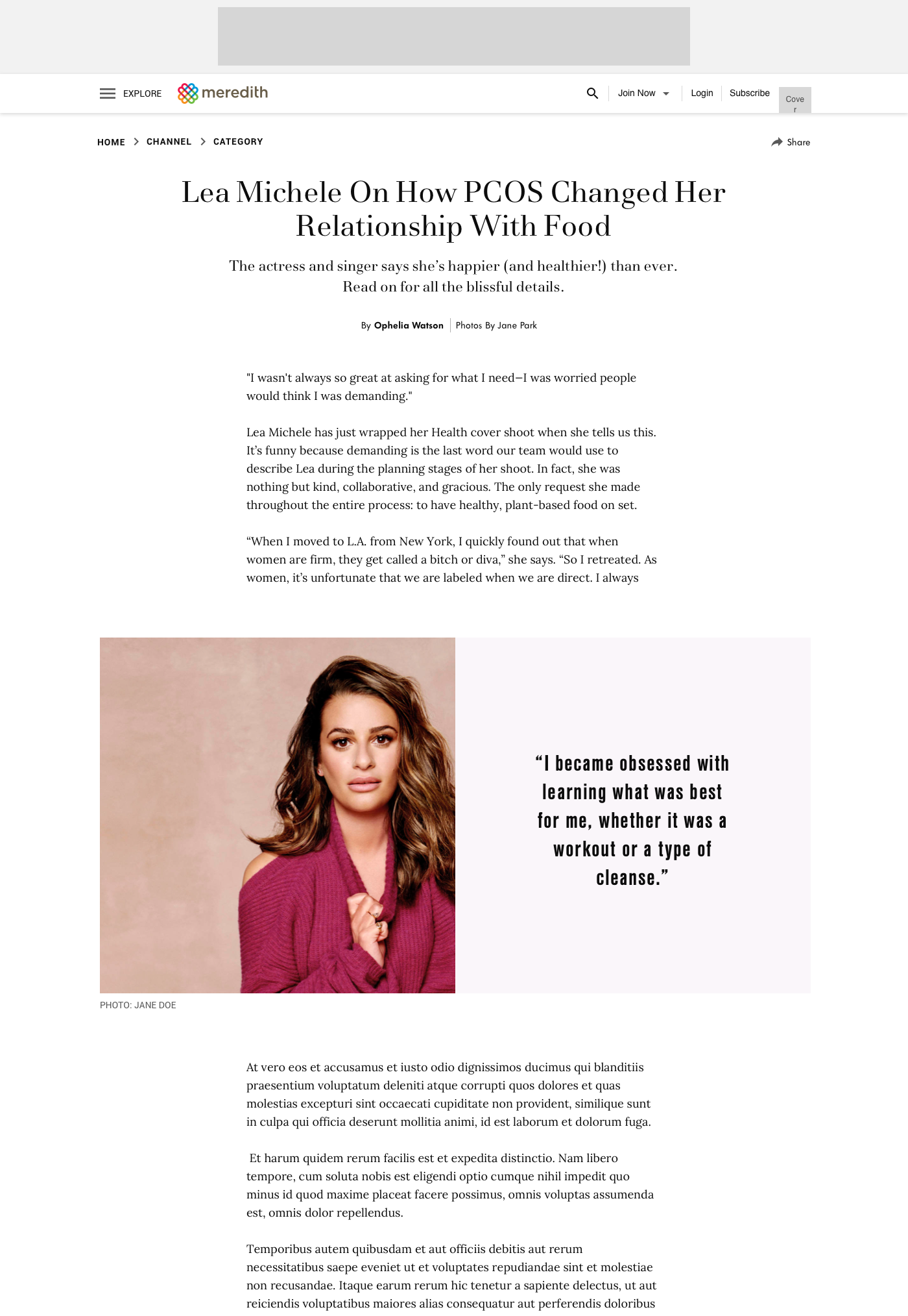
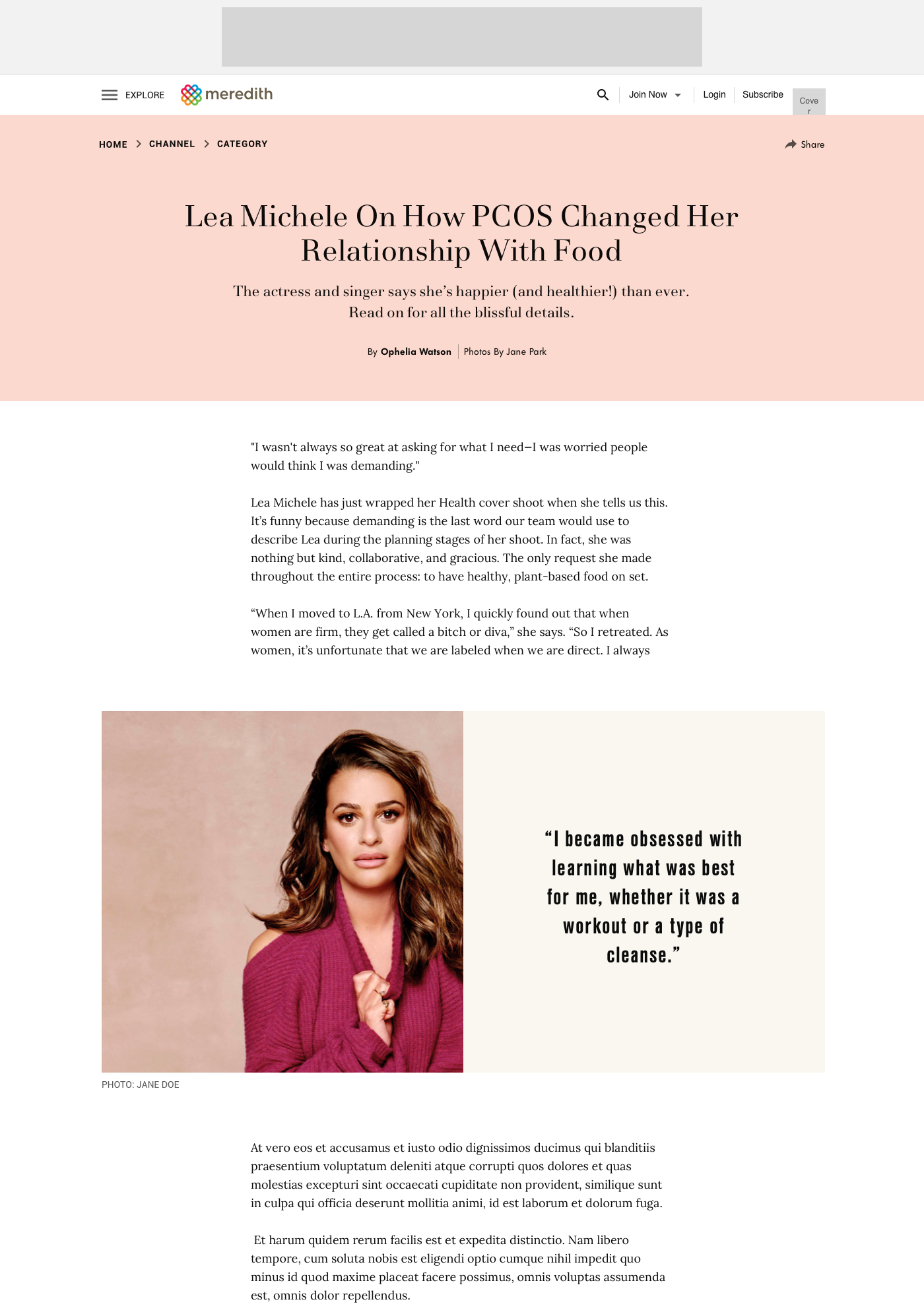
Meredith’s existing white-label article template was being used across all brands, but stakeholders identified a gap: there was no template optimized for extended, long-form content. Editors needed a more expressive layout with richer design capabilities, while product teams noted that bounce rates increased significantly once articles exceeded a certain length. The challenge was to create a template that improved long-form readability, supported deeper engagement through visual breaks and media, and remained flexible enough for 40+ brands operating within a shared backend and design system.
Solution
As lead designer, I created a scalable long-form article template that could be adopted across all Meredith brands while preserving opportunities for brand-level customization. Through iterative reviews with the VP of Design, product managers, editors, and engineering, I delivered a modular solution that provided editors with configurable layout options while upholding system-wide consistency, accessibility, and ease of implementation.
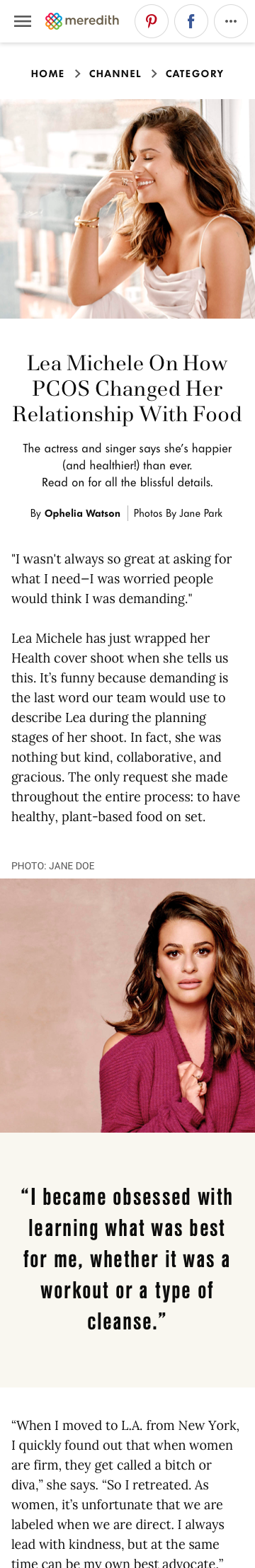
Sketches & Early Exploration
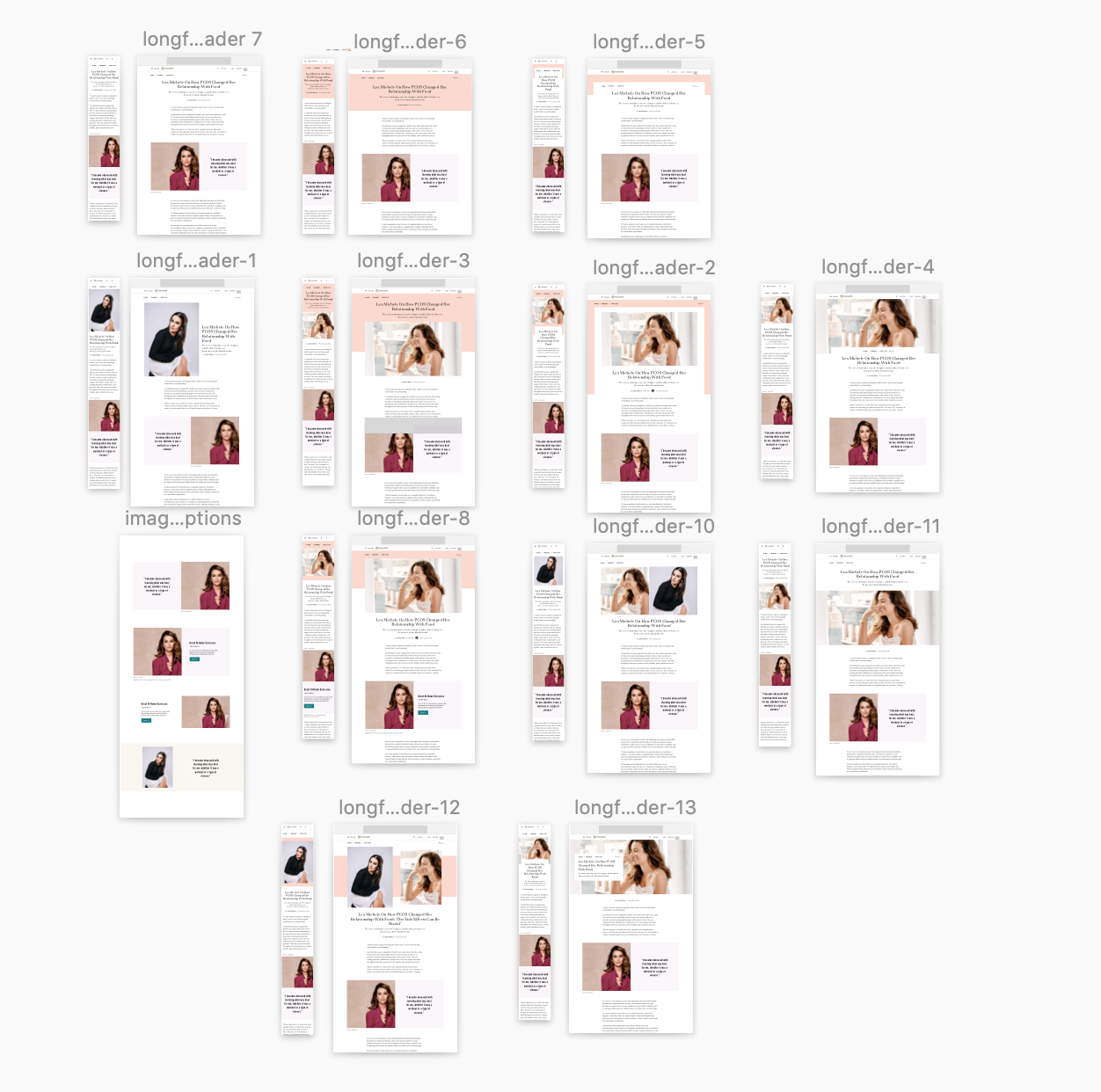
I began with rapid sketches and wireframes to visualize options and accelerate early decision-making. Using insights from stakeholder interviews, business goals, and design-system constraints, I explored how the existing article structure could evolve to support richer storytelling. A key differentiator for the long-form template was a redesigned header, with variations that included hero images, multiple images, or no imagery at all—each offering distinct editorial and visual opportunities.
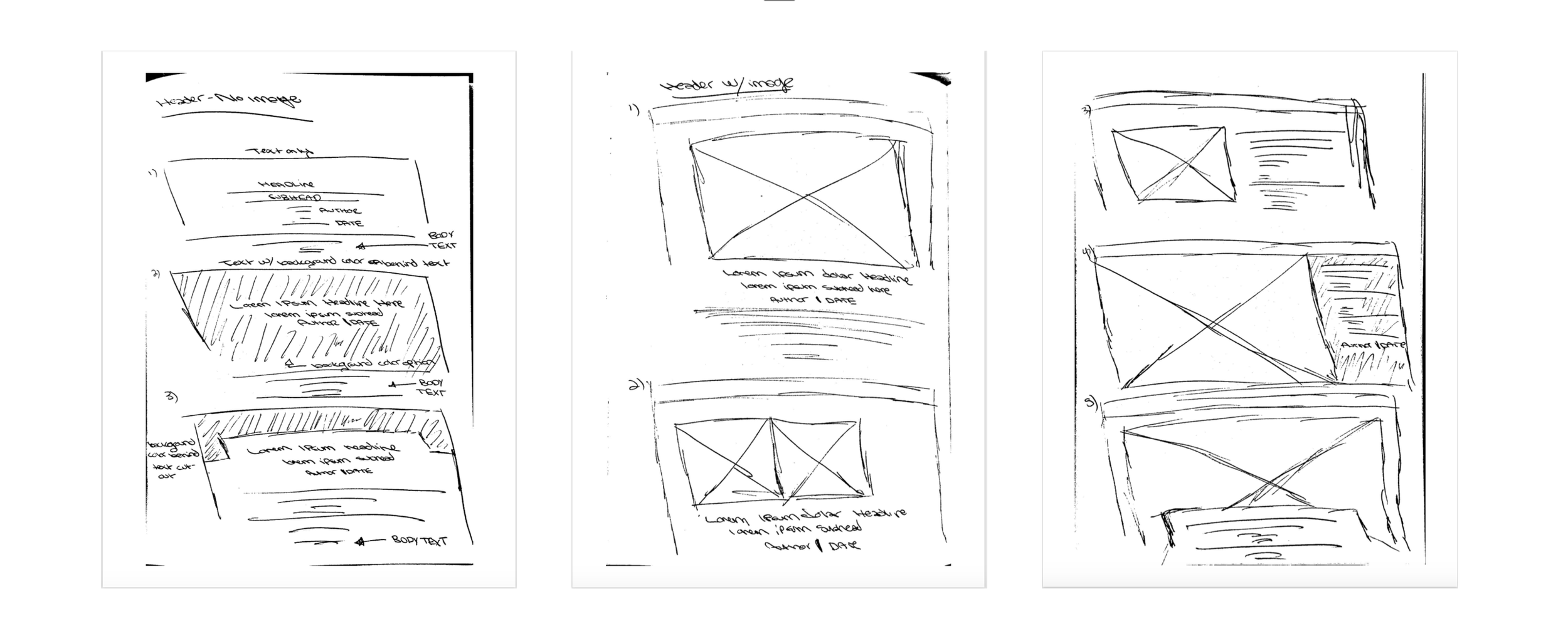
Low-Fidelity Designs
I translated my sketches into low-fidelity wireframes in Sketch, creating defined layouts suitable for peer and leadership review. The initial presentation included roughly ten header variations that demonstrated different approaches to hierarchy, media, and brand expression. These concepts highlighted the range of possibilities available while grounding the designs in feasible, scalable UI patterns.
Initial lo-fi wireframes based off of initial sketches and design inspiration. At this stage, the VP of design asked for more exploration to be done.
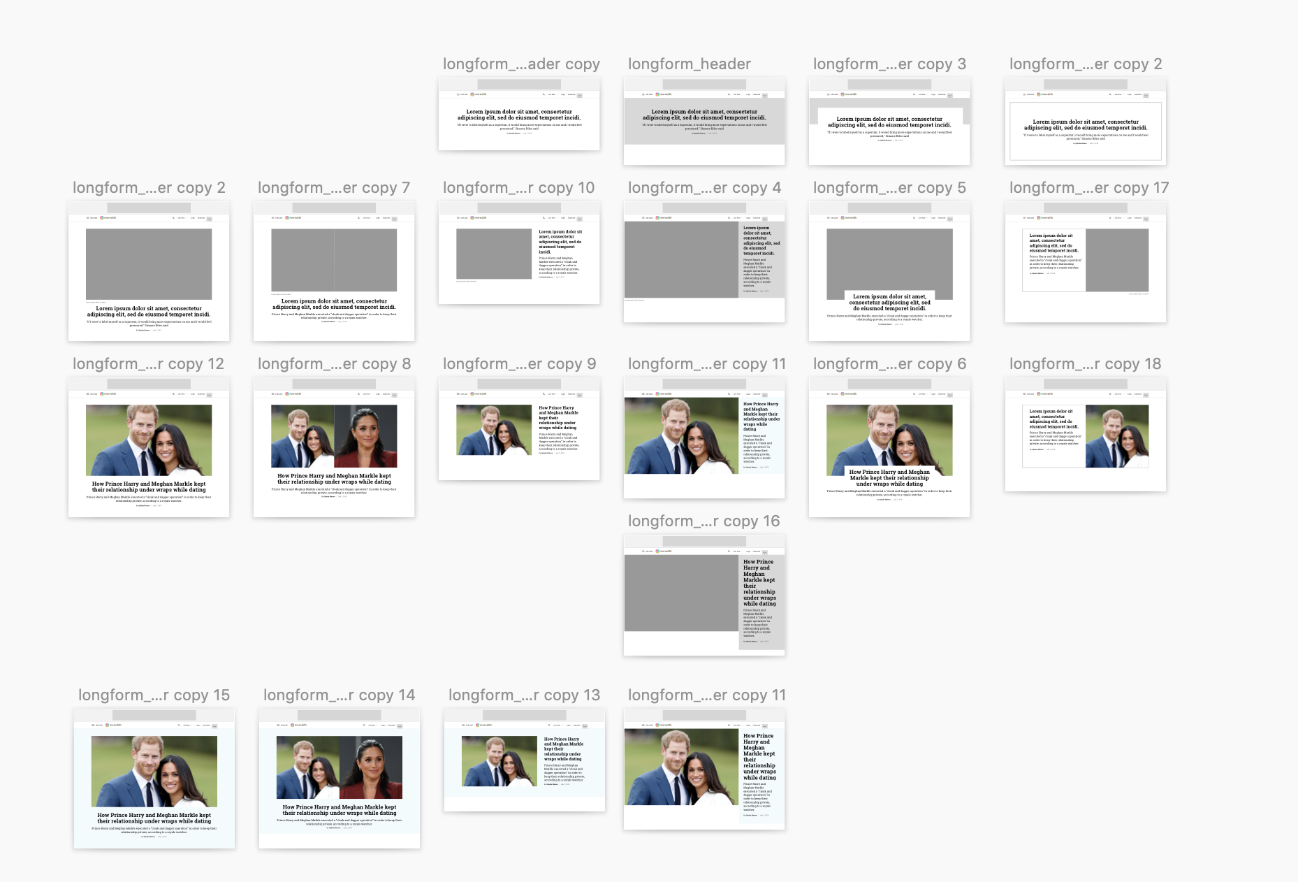
Feedback, Iteration & System Refinement
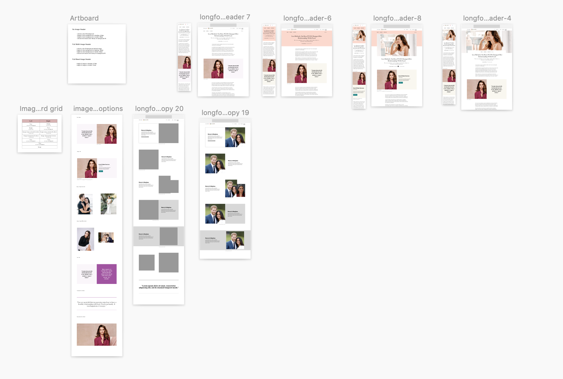
Following initial reviews, I expanded the explorations to think more holistically about how each header concept could evolve across a modular system. I defined three primary header types—no-image, single-image, and multi-image—and explored a progressive evolution between them to ensure coherence and flexibility across use cases.
A major focus during iteration was ensuring editors had meaningful customization options while preventing accessibility or implementation risks. I introduced color-based customization within controlled parameters and collaborated closely with engineering to build backend restrictions that prevented editors from selecting non-compliant color combinations.
Throughout this phase, I delivered multiple rounds of refined header variations for continued peer and stakeholder review.
Early explorations revealed that a single template wouldn’t accommodate the full range of user journeys, editorial goals, and brand variations.
This round of iteration raised the question of whether a single template would sufficiently support editor workflows. We began evaluating how to structure a family of templates that offered progressively richer customization while remaining cohesive and predictable within the design system.
Exploring how each header design could progress into another so that they evolve in complexity and features on both desktop and mobile.
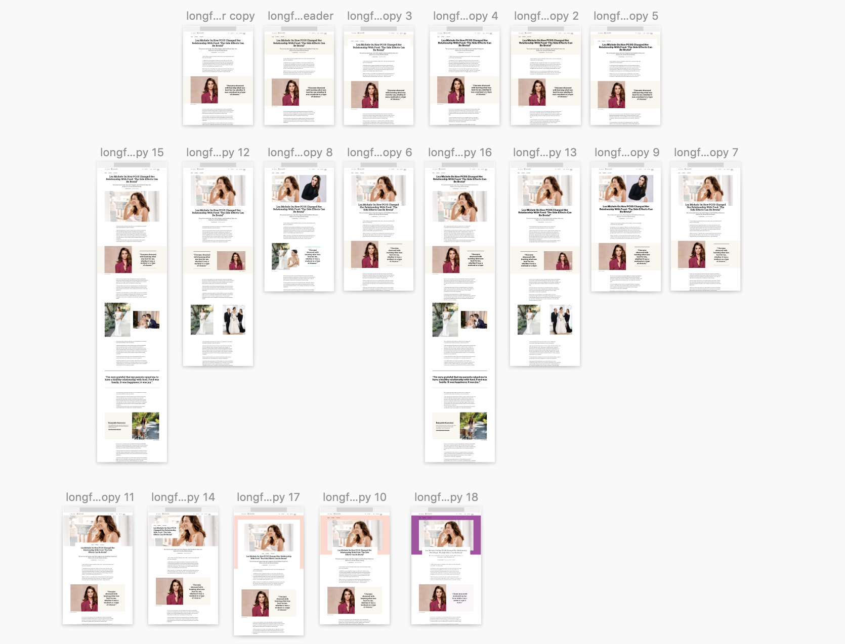
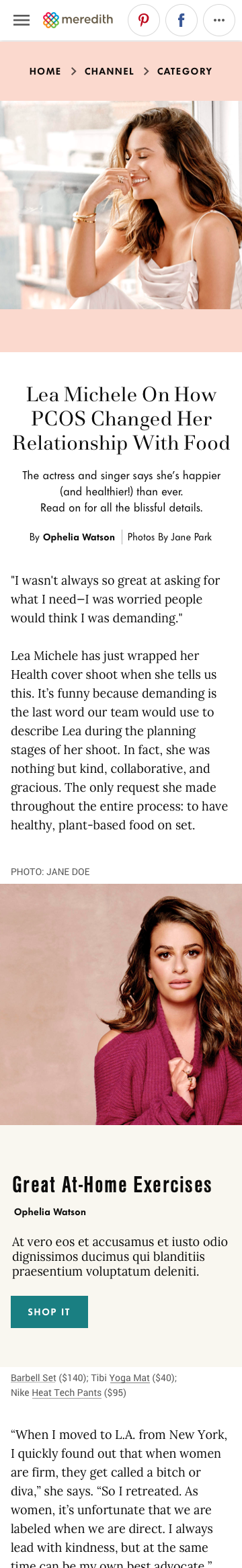
Article Features & Modular Content Blocks
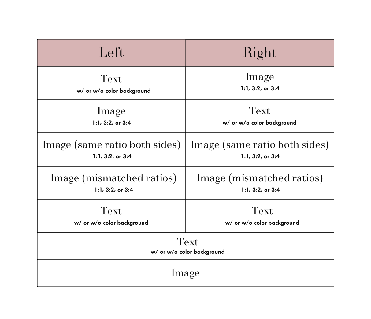
Stakeholders also requested new, more dynamic content blocks that could be plugged into the long-form template to break up text and support richer storytelling. I began by analyzing the core atoms in our existing design system—primarily text and image styles—and mapping all possible combinations.
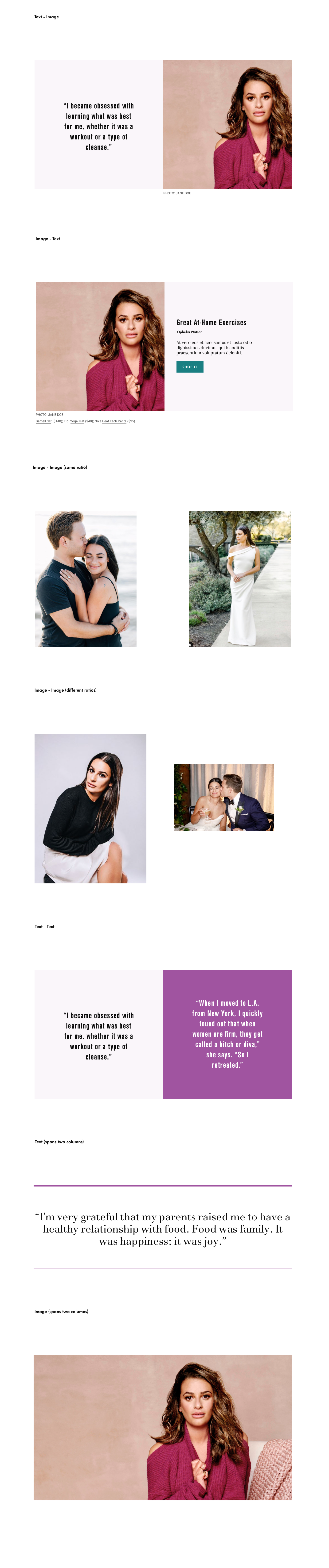
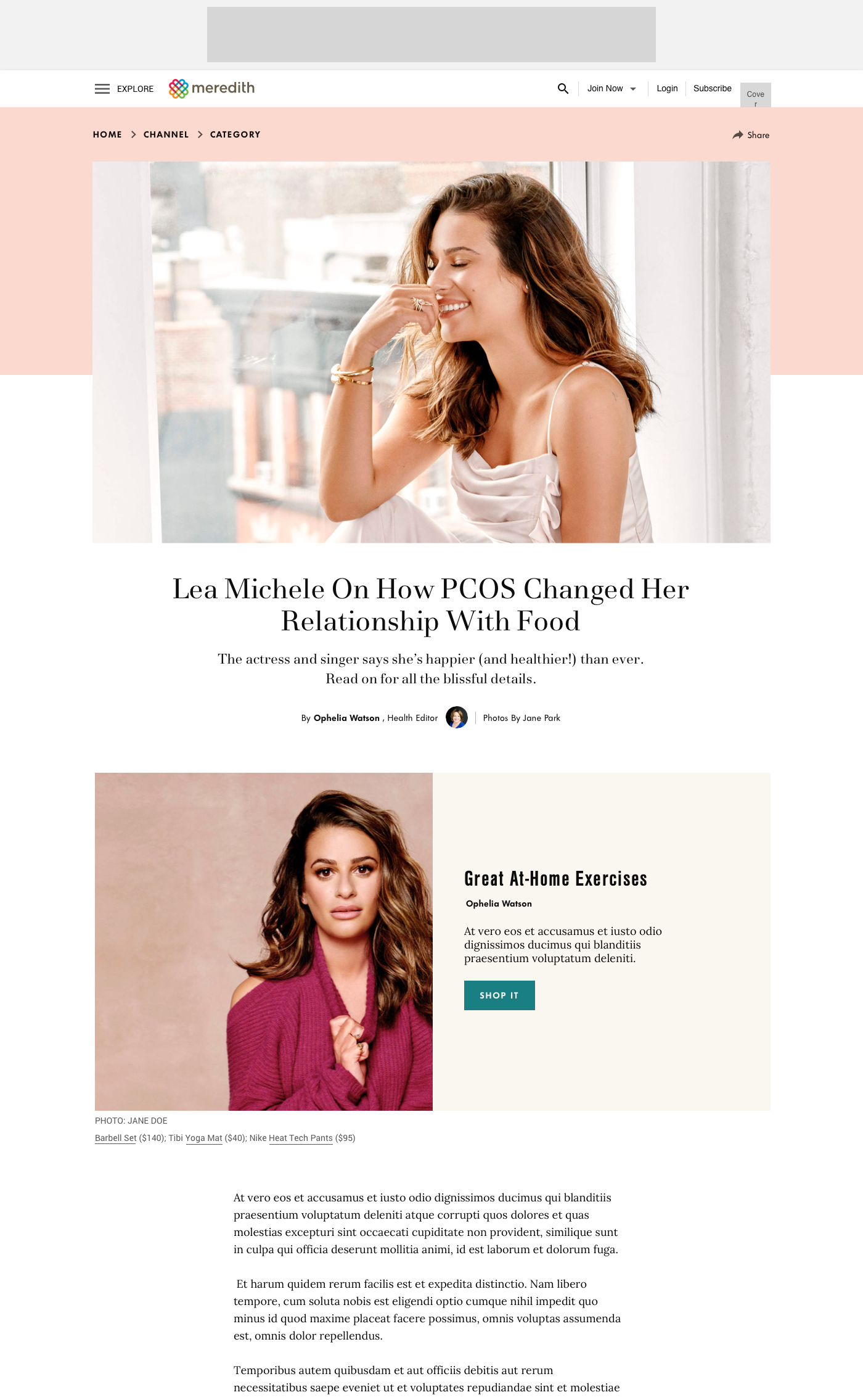
By creatively recombining existing components, I designed seven new content blocks that editors could select on the backend. These modules increased engagement, offered greater editorial flexibility, and distinguished long-form articles from standard templates while remaining fully aligned with the established design system.
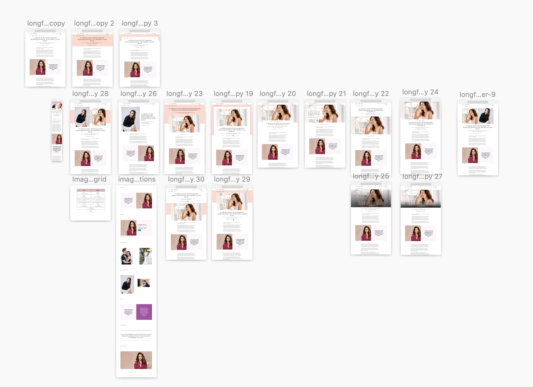
Final Designs
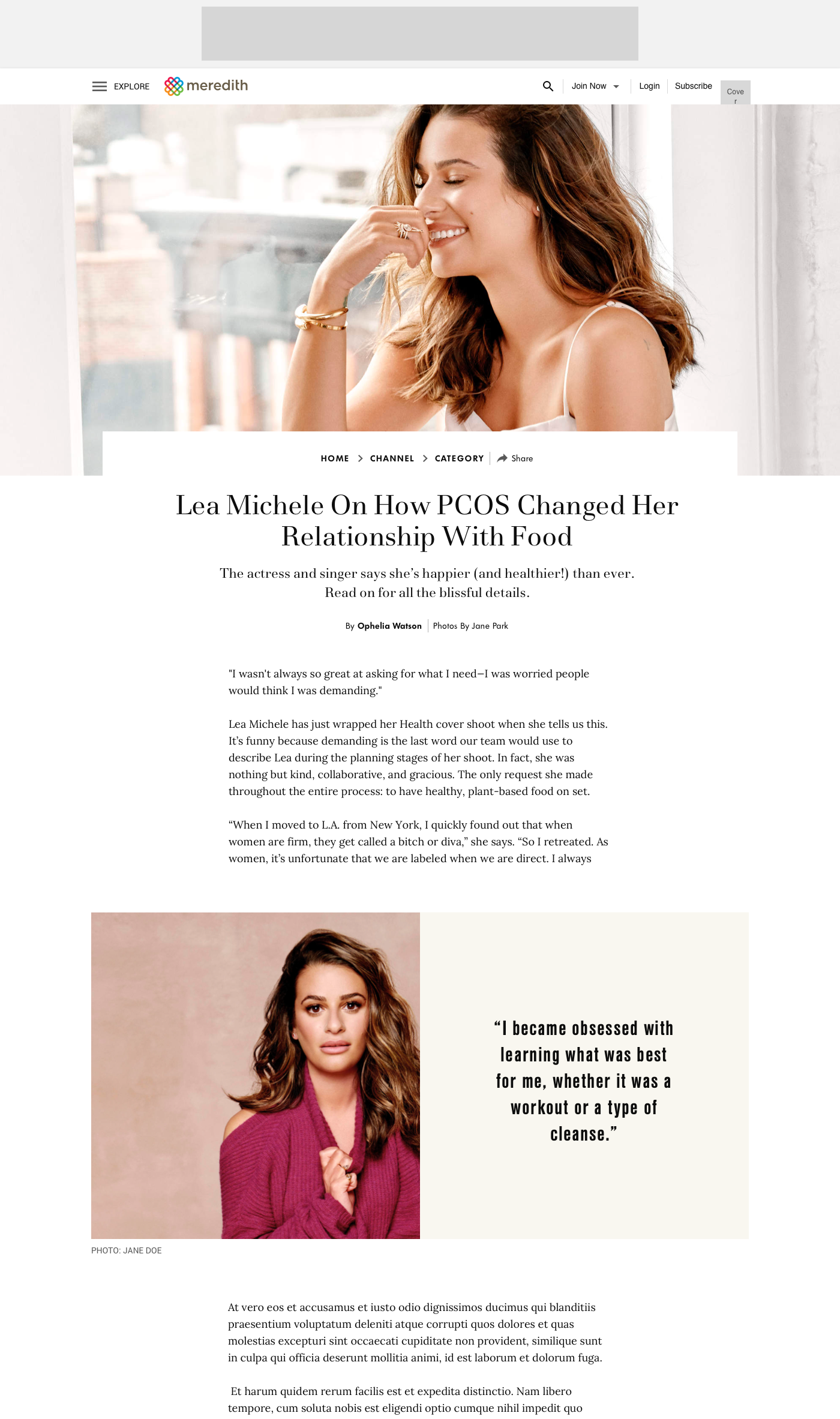
The project delivered two interconnected bodies of work. First, four approved header templates — no-image, no-image with color background, full-width image, and full-bleed image — each designed to integrate seamlessly with the existing design system while giving editors meaningful range. Second, seven new modular content blocks that editors could plug into any long-form article to break up text and support richer storytelling. Both the templates and the content blocks were built entirely from existing design system components, which minimized engineering overhead and kept the system coherent across 30+ brands.
Reflections
What surprised me most about this project was how much of the design work happened in conversation rather than in Sketch. The scope expanded from one template to four not because the brief changed, but because the reviews kept surfacing something truer about what editors actually needed. Learning to hold that tension — staying in exploration longer than felt comfortable, while still driving toward a decision — was probably the most useful thing I took from this project. I also came away with a clearer instinct for designing within systems: the constraint of reusing existing components forced a kind of creativity I don't think I would have found otherwise.